Introduction
data("faithful")
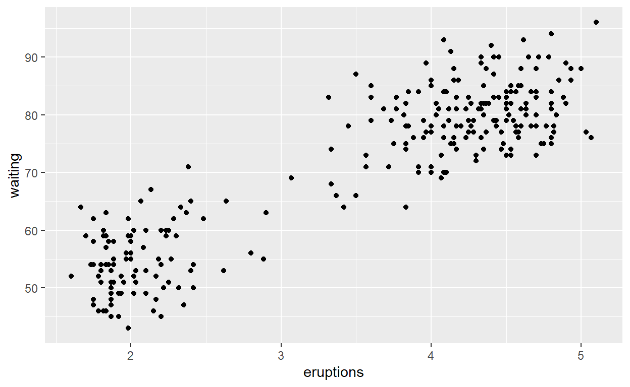
# Basic Scatterplot
ggplot(data = faithful,
mapping = aes(x = eruptions, y = waiting)) +
geom_point()
# Data and ampping can be given both as global (in ggplot()) or per layer

ggplot() +
  geom_point(mapping = aes(x = eruptions, y = waiting),
             data = faithful)

25 - 35
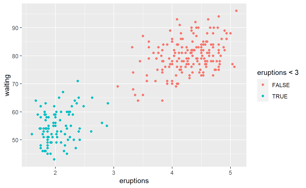
ggplot(faithful) +
  geom_point(aes(x = eruptions,
                 y = waiting,
                 colour = eruptions < 3))
simplify
ggplot(faithful) +
  geom_point(aes( x = eruptions, y = waiting),
             color = 'steelblue')
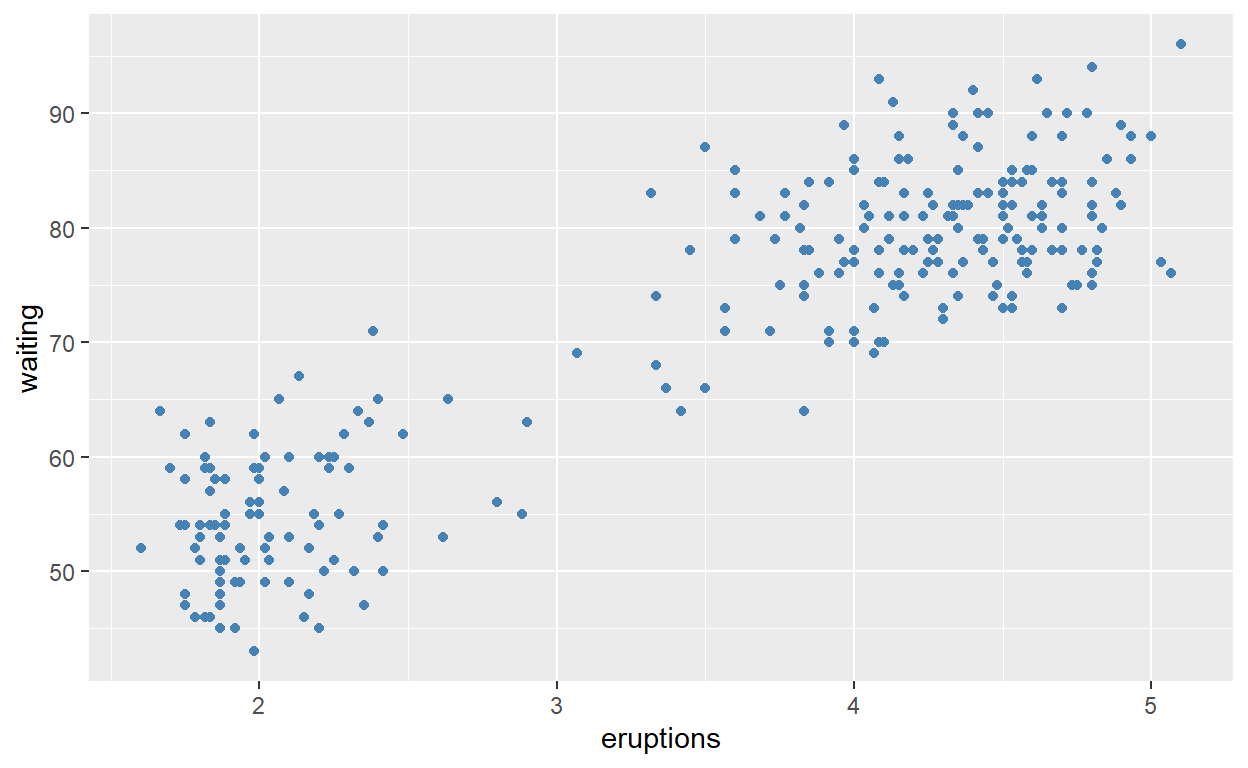
Single mapping
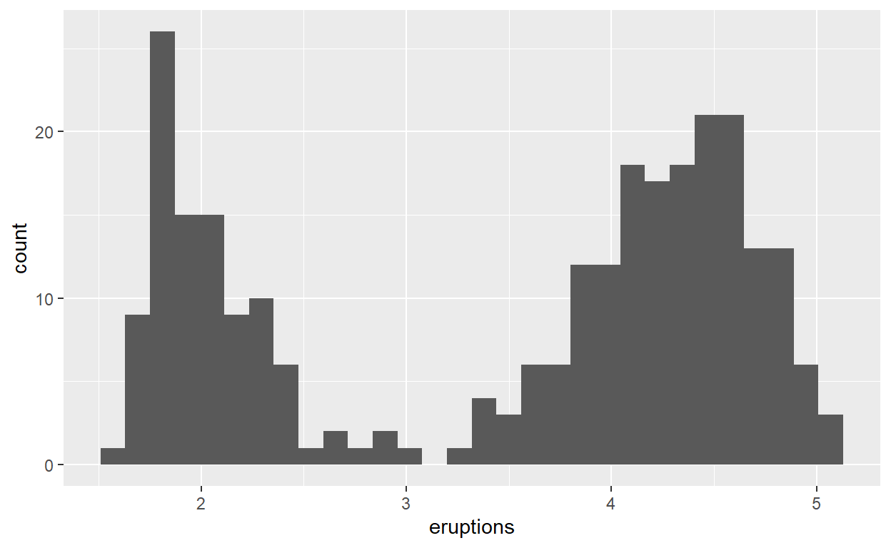
ggplot(faithful) +
  geom_histogram(aes(x = eruptions))
36-38
Layers
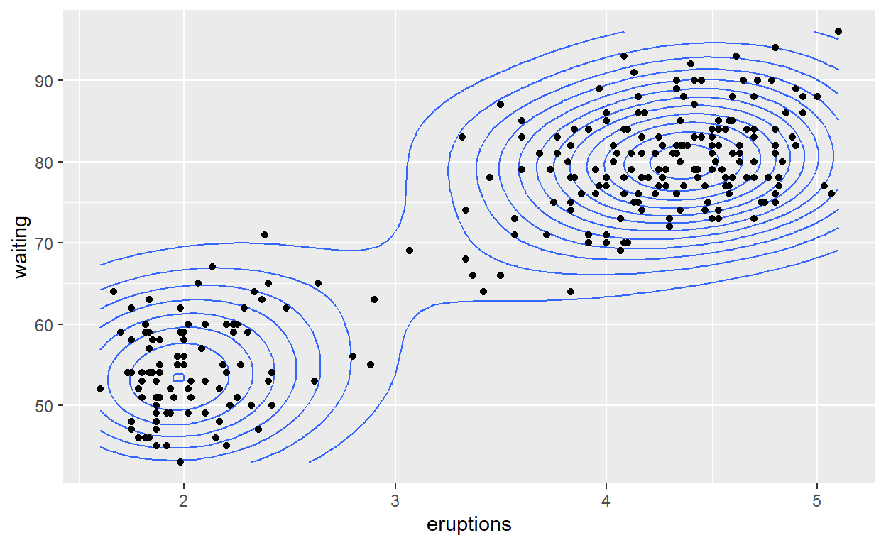
ggplot(faithful,
       aes(x = eruptions, y = waiting)) +
  geom_density_2d() +
  geom_point()
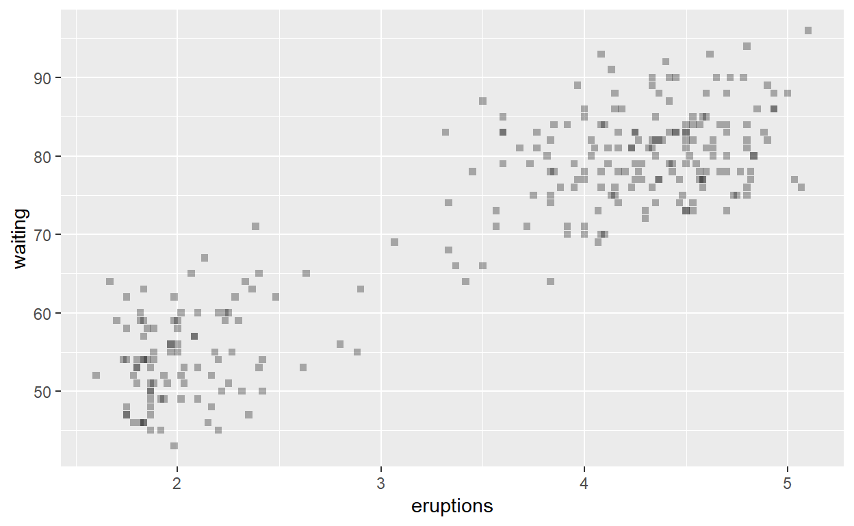
Transparent
ggplot(faithful) +
  geom_point(aes(x = eruptions, y = waiting), shape = 'square', alpha = 0.3)
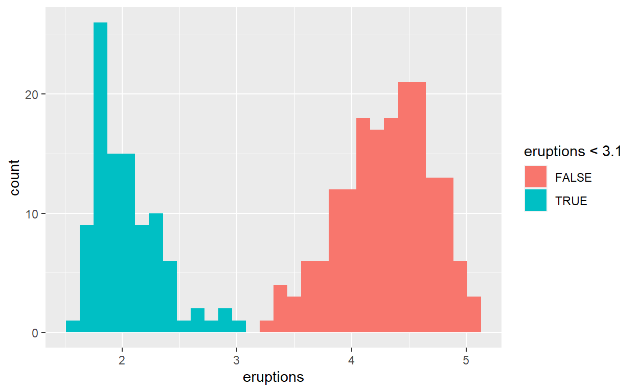
ggplot(faithful) +
  geom_histogram(aes( x = eruptions, fill = eruptions < 3.1))
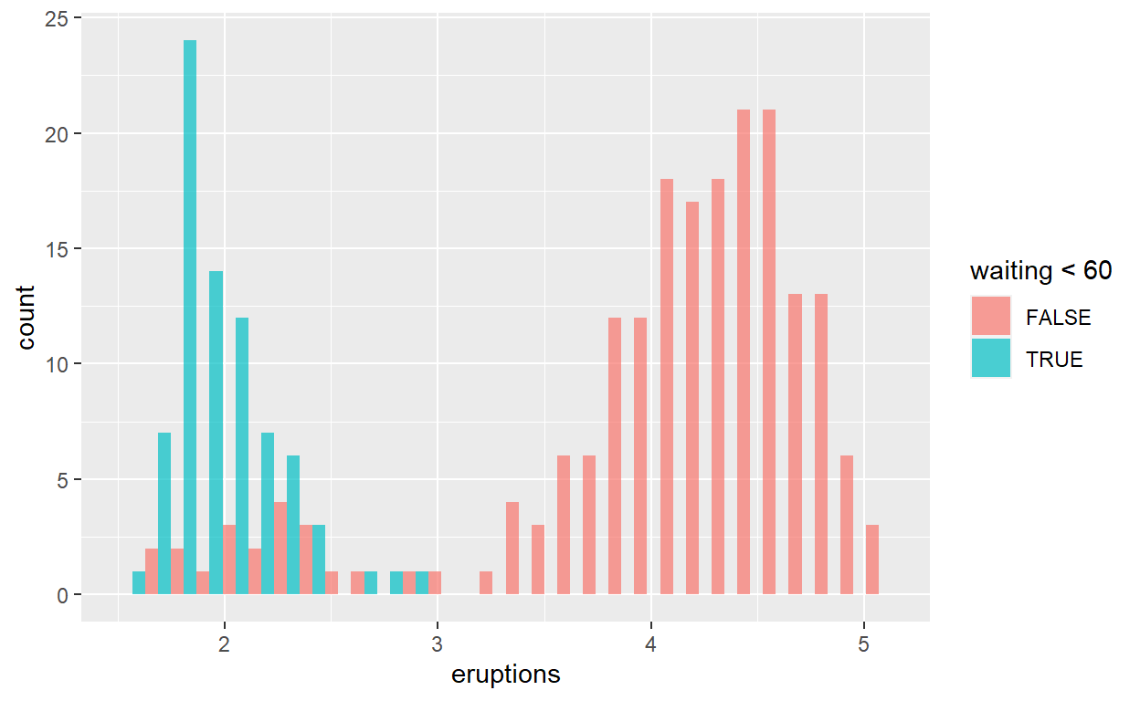
ggplot(faithful) +
  geom_histogram(aes(x = eruptions, fill = waiting < 60), position = 'dodge', alpha = 0.7)
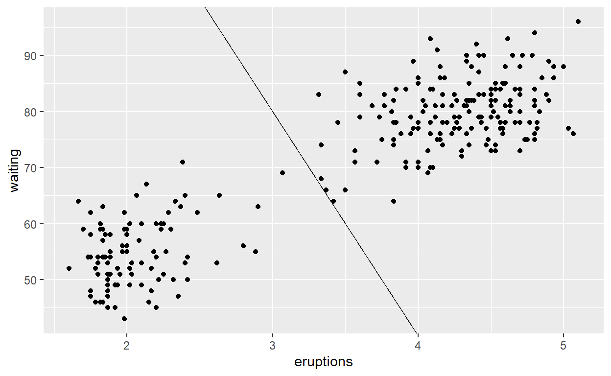
Add a line that separates the two point distributions. See ?geom_abline for how to draw straight lines from a slope and intercept.
ggplot(faithful) +
  geom_point(aes(x = eruptions, y = waiting)) +
  geom_abline(slope = -40, intercept = 200)
39-45 slides

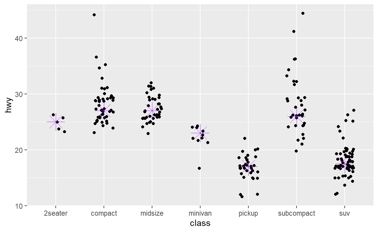
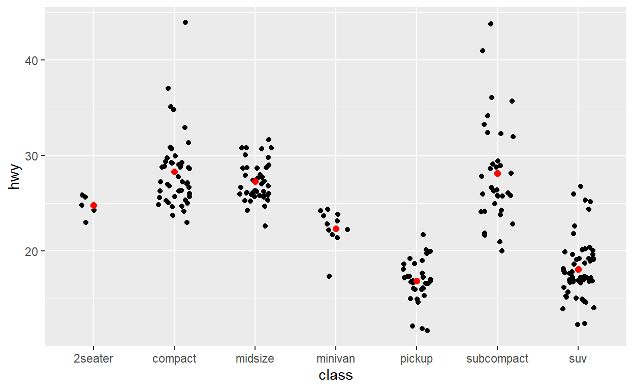
Use stat_summary() to add a red dot at the mean hwy for each group
ggplot(mpg) +
  geom_jitter(aes(x = class, y = hwy), width = 0.2) +
  stat_summary(aes(x = class, y = hwy), fun = mean, geom = 'point', color = 'red', size = 2)
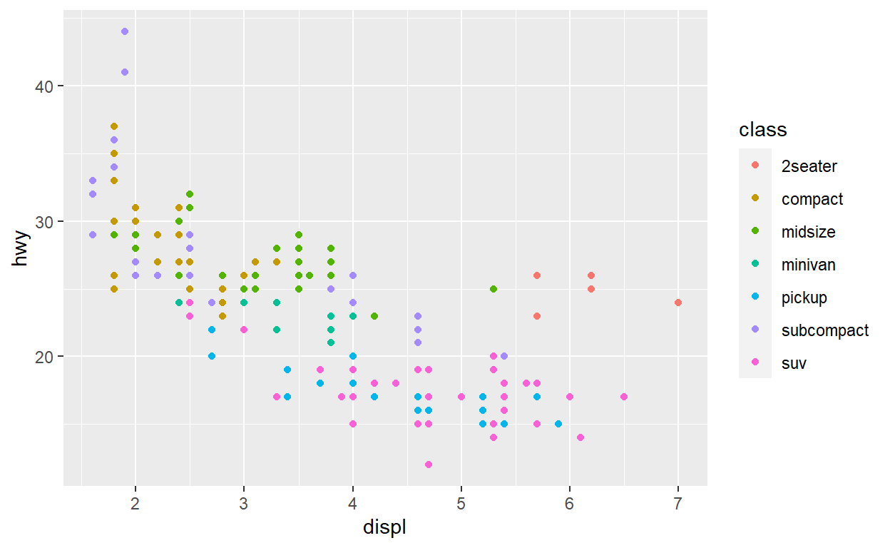
ggplot(mpg) +
  geom_point(
    aes( x = displ, y = hwy, color = class)
  )
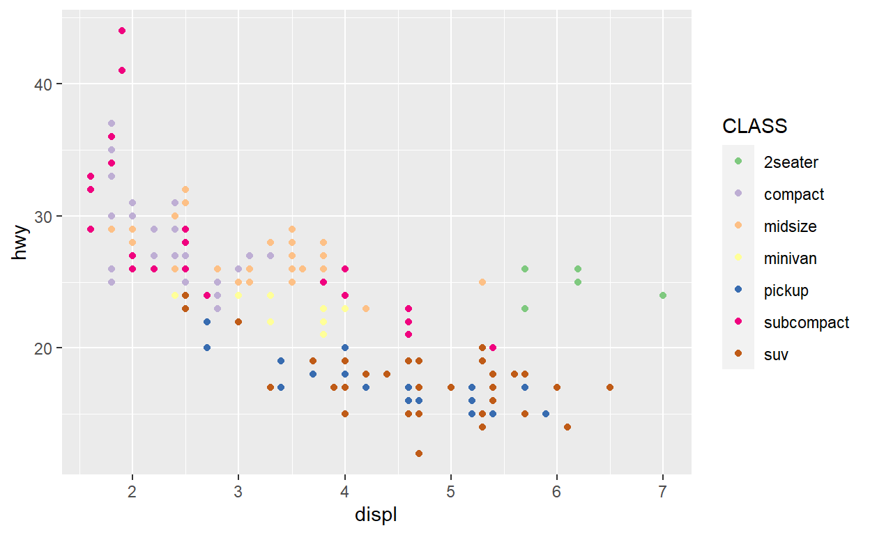
ggplot(mpg) +
  geom_point(
    aes(x = displ, y = hwy, color = class)
  ) +
  scale_color_brewer(name = "CLASS", type = 'qual')
49
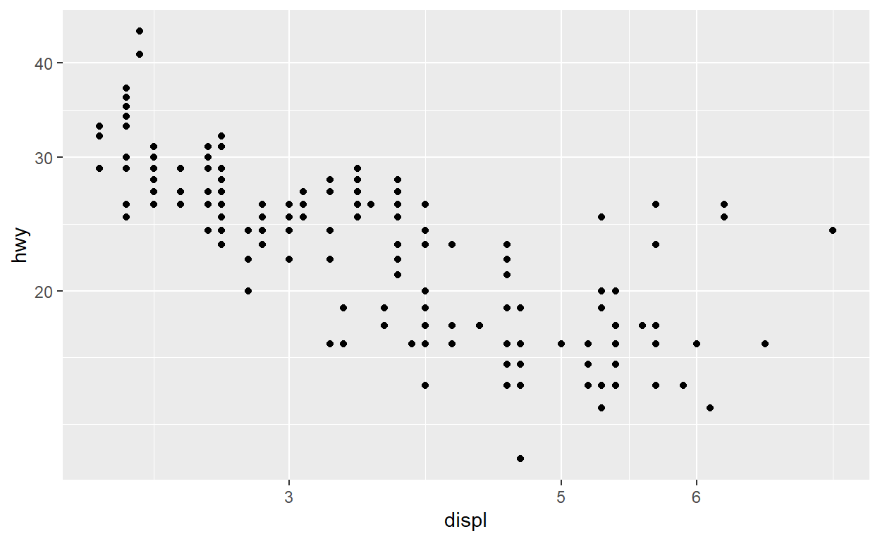
ggplot(mpg) +
  geom_point(aes(x = displ, y = hwy)) +
  scale_x_continuous(breaks = c(3,5,6)) +
  scale_y_continuous(trans = 'log10')
Exercises
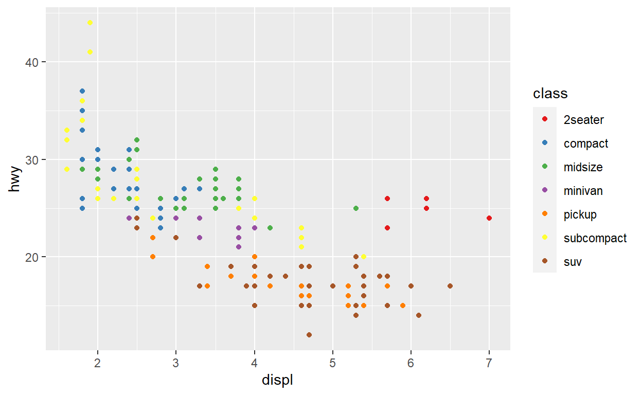
Use RColorBrewer::display.brewer.all() to see all the different palettes from Color Brewer and pick your favourite. Modify the code below to use it
ggplot(mpg) +
  geom_point(aes(x = displ, y = hwy, color = class)) +
  scale_color_brewer(palette = 'Set1')
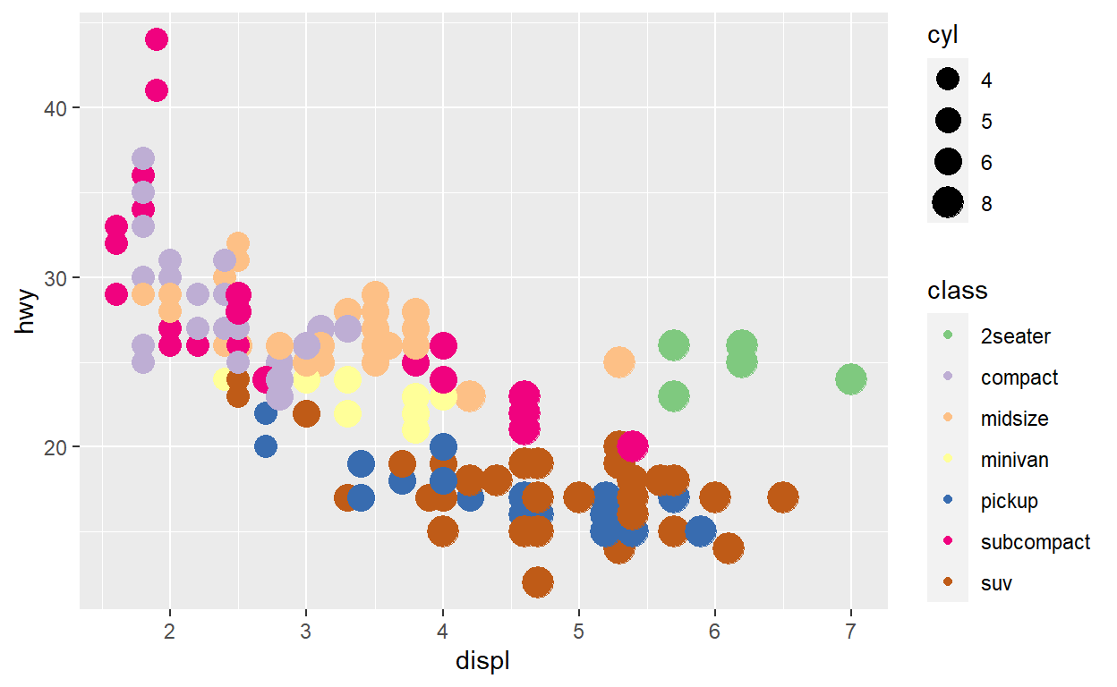
Modify the code below to create a bubble chart (scatterplot with size mapped to a continuous variable) showing cyl with size. Make sure that only the present amount of cylinder (4,5,6, and 8) are present in the legend.
ggplot(mpg)+
  geom_point(aes(x = displ, y = hwy, color = class, size = cyl)) +
  scale_color_brewer(type = 'qual') +
  scale_size_area(breaks = c(4,5,6,8))
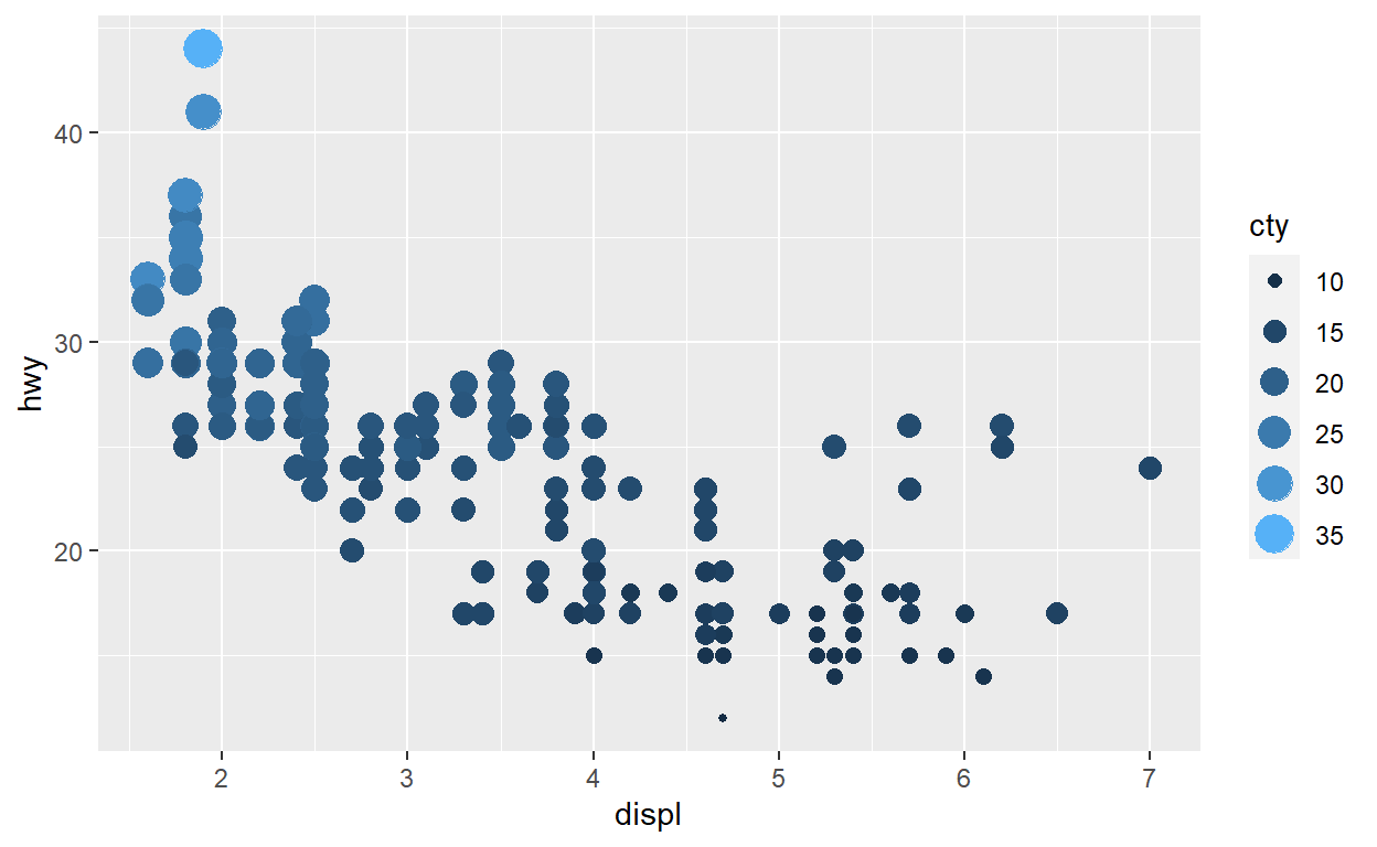
Modify the code below so that colour is no longer mapped to the discrete class variable, but to the continuous cty variable. What happens to the guide?
ggplot(mpg) +
  geom_point(aes(x = displ, y = hwy, color = cty, size = cty)) +
  guides(color = 'legend')
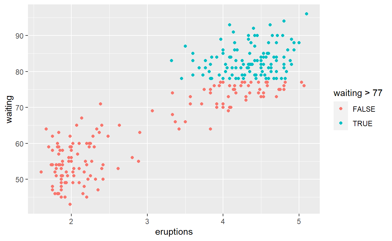
**** Quiz Q1
ggplot(faithful) +
  geom_point(aes(x = eruptions, y = waiting,
             color = waiting > 77))
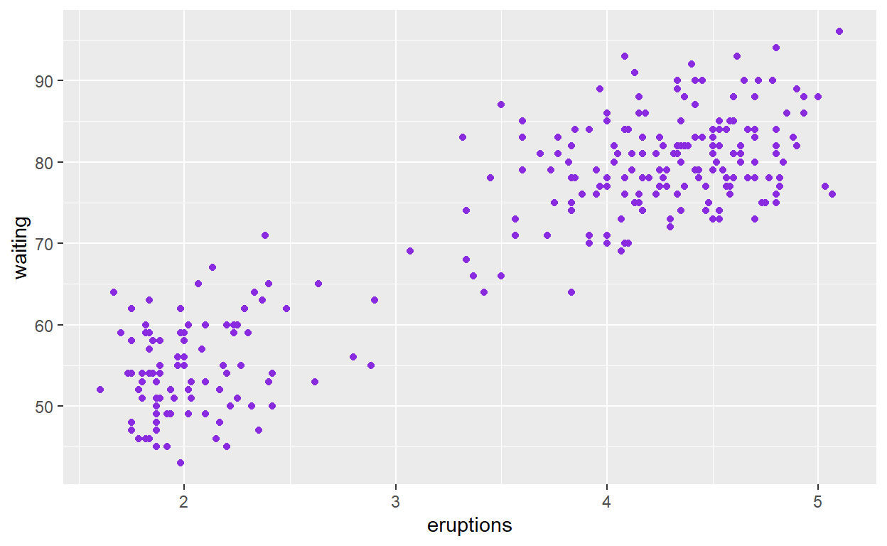
Quiz Q2
ggplot(faithful) +
  geom_point(aes(x = eruptions, y = waiting), color = "blueviolet")
Quiz Q3
ggplot(faithful) +
  geom_histogram(aes(x = waiting))
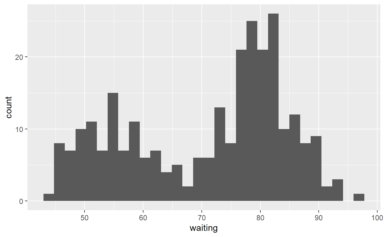
Quiz Q4
ggplot(faithful) +
  geom_point(aes(x = eruptions, y = waiting),
             shape ="cross", size = 4, alpha = 0.3)
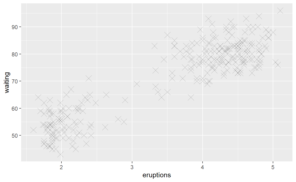
Quiz Q5
ggplot(faithful) +
  geom_histogram(aes(x = eruptions, fill = eruptions > 3.2))
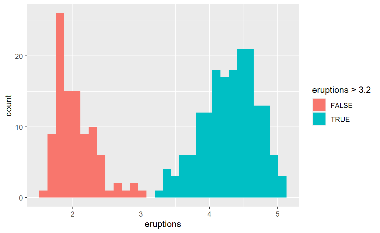
Quiz Q6

Quiz Q7
mpg_counted <- mpg %>%
  count(manufacturer, name = 'count')
ggplot(mpg_counted) +
  geom_bar(aes(x = manufacturer, y = count), stat = 'identity')
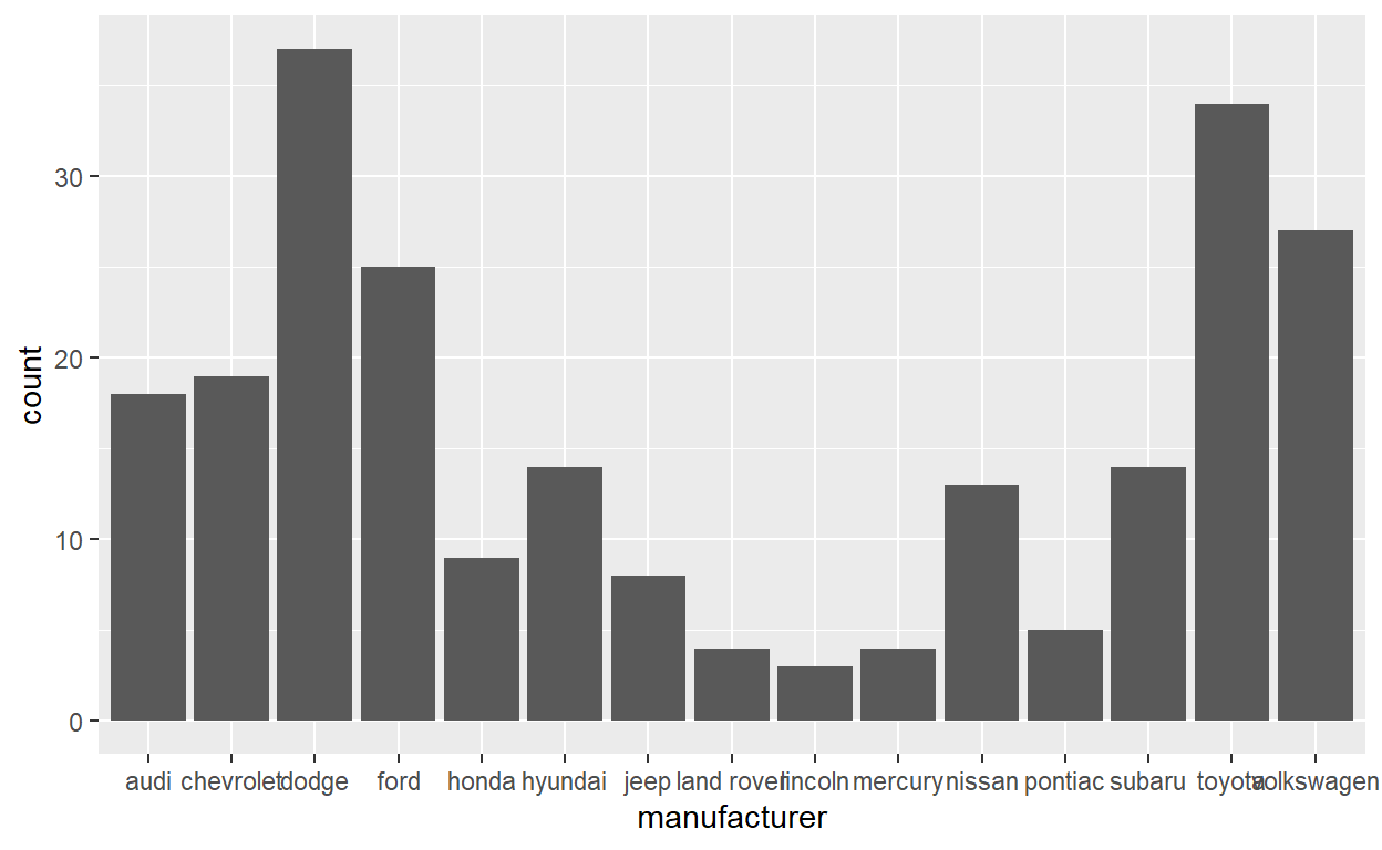
Quiz Q8
ggplot(mpg) +
  geom_bar(aes(x = manufacturer, y = after_stat(10*count/sum(count))))
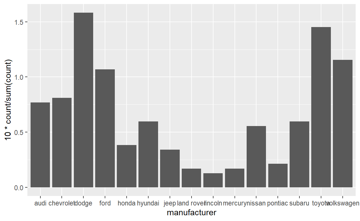
Quiz Q9
ggplot(mpg) +
  geom_jitter(aes(x = class, y = hwy), width = 0.2) +
  stat_summary(aes(x = class, y = hwy), geom = "point",
               fun = "median", color = "purple",
               shape = "asterisk", size = 7)