Facets
The facet defines how data is split among panels. The default facet (facet_null()) puts all the data in a single panel, while facet_wrap() and facet_grid() allows you to specify different types of small multiples
## This is the preferred method now
## Use vars(class) instead of ~ class
## See https://ggplot2.tidyverse.org/reference/facet_wrap.html
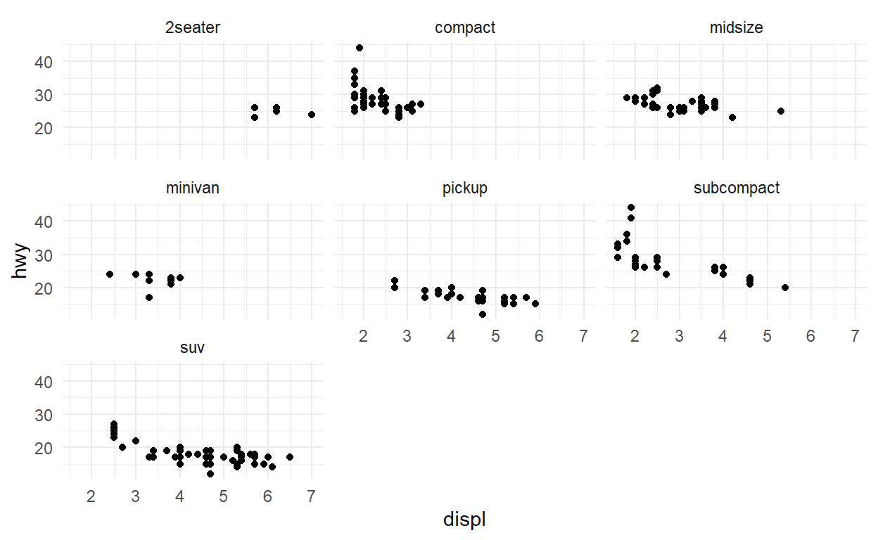
ggplot(mpg) +
geom_point(aes(x = displ, y = hwy)) +
facet_wrap(vars(class))
## See https://ggplot2.tidyverse.org/reference/facet_grid.html
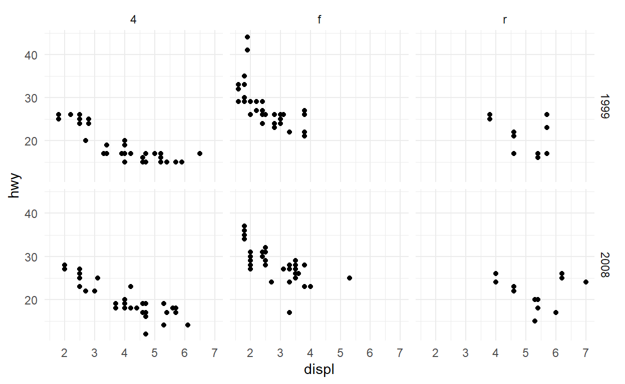
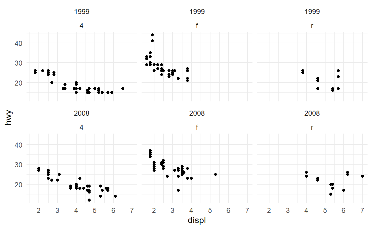
ggplot(mpg) +
geom_point(aes(x = displ, y = hwy)) +
facet_grid(rows = vars(year), cols = vars(drv))
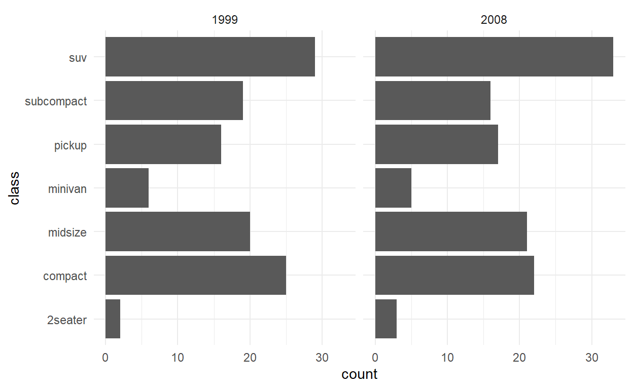
Exercises facet
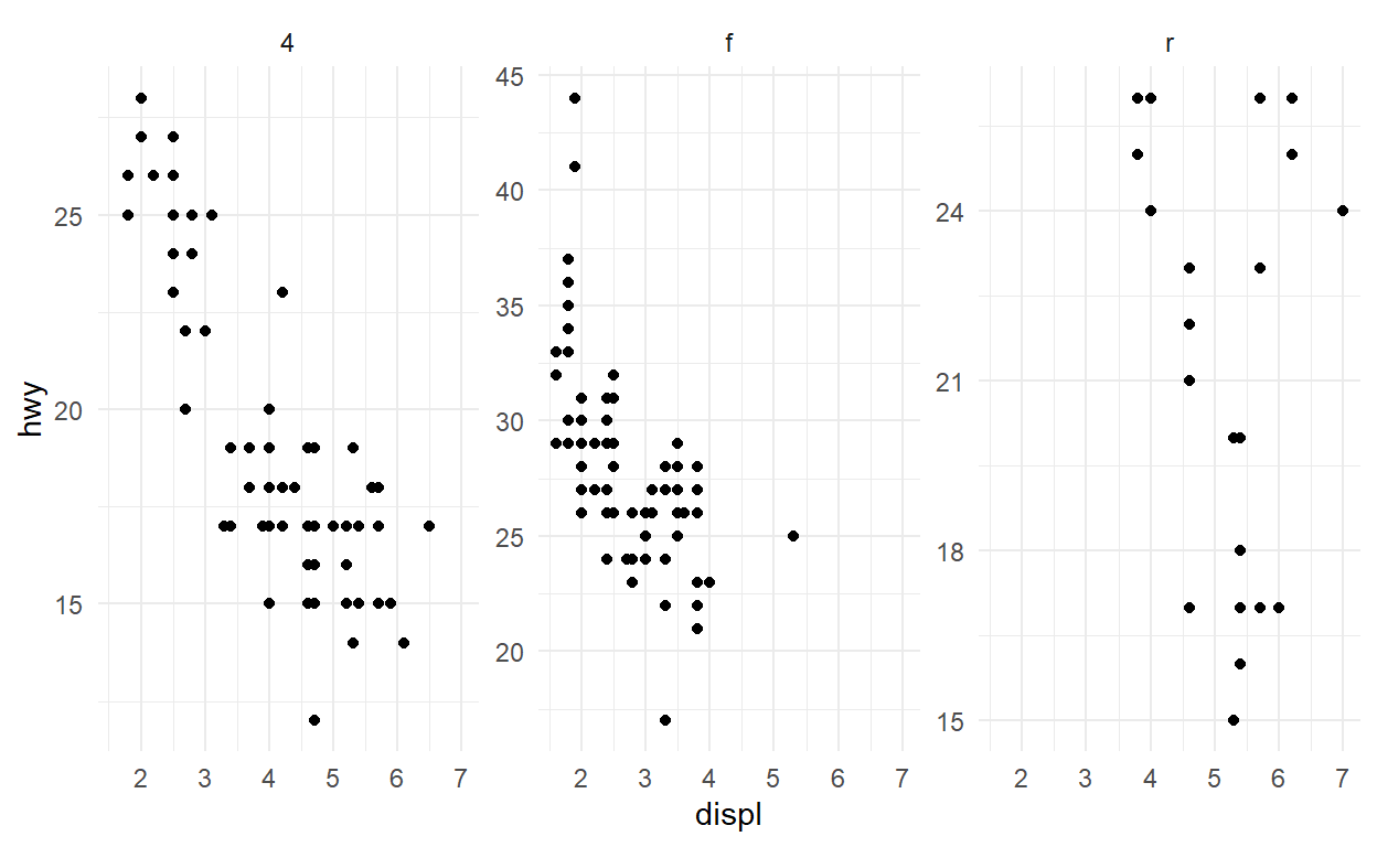
One of the great things about facets is that they share the axes between the different panels. Sometimes this is undesirable though, and the behaviour can be changed with the scales argument. Experiment with the different possible settings in the plot below:
ggplot(mpg) +
  geom_point(aes(x = displ, y = hwy)) +
  facet_wrap(vars(drv), scales = 'free_y')
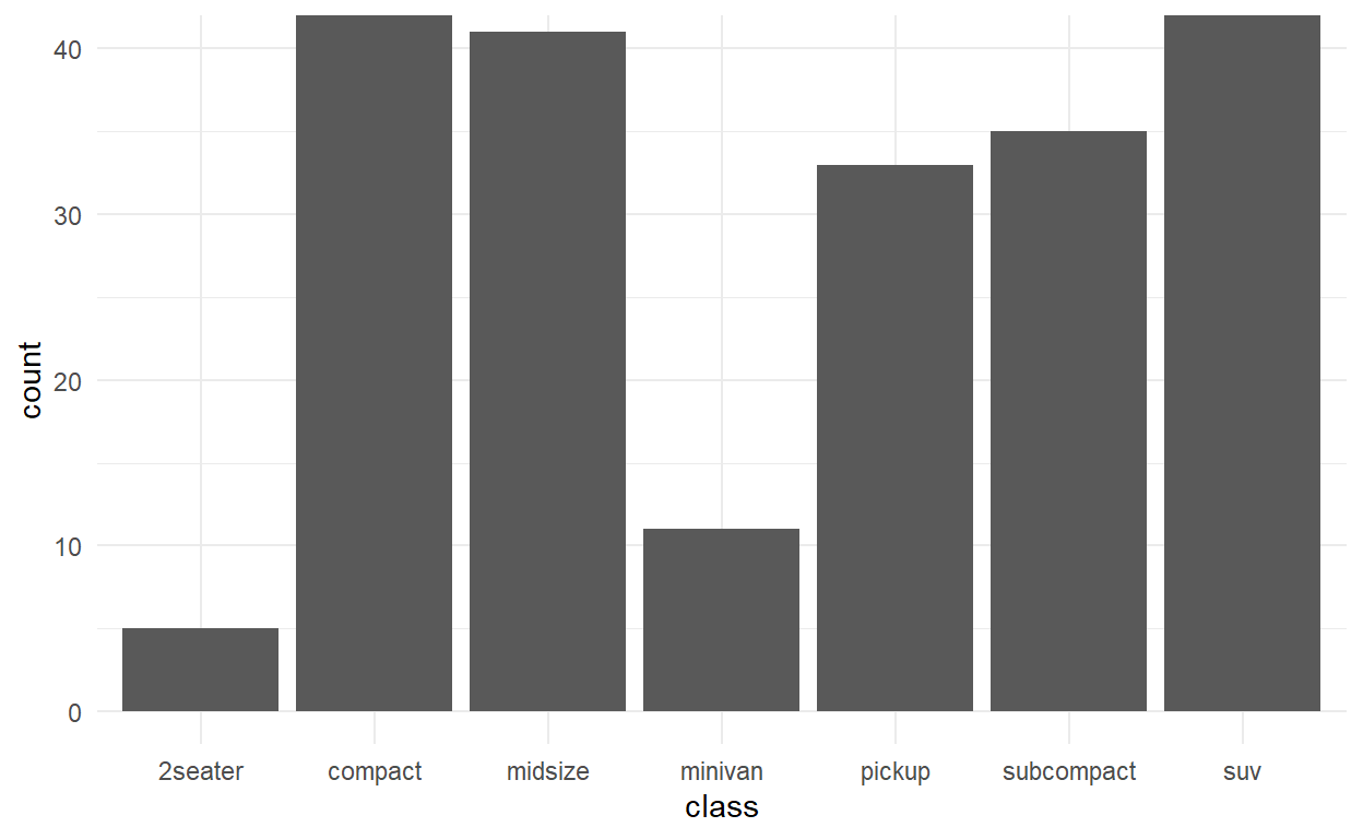
Usually the space occupied by each panel is equal. This can create problems when different scales are used. Modify the code below so that the y scale differs between the panels in the plot. What happens?
ggplot(mpg) +
  geom_bar(aes(y = manufacturer)) +
  facet_grid(rows = vars(class), space = 'free_y', scales = 'free_y')

Use the space argument in facet_grid() to change the plot above so each bar has the same width again.
Facets can be based on multiple variables by adding them together. Try to recreate the same panels present in the plot below by using facet_wrap()
ggplot(mpg) +
  geom_point(aes(x = displ, y = hwy)) +
  facet_grid(rows = vars(year), cols = vars(drv))

ggplot(mpg) +
  geom_point(aes(x = displ, y = hwy)) +
  facet_wrap(vars(year, drv))
Coordinates
The coordinate system is the fabric you draw your layers on in the end. The default `coord_cartesion provides the standard rectangular x-y coordinate system. Changing the coordinate system can have dramatic effects
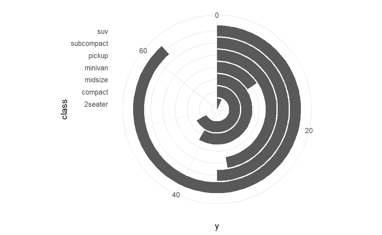
ggplot(mpg) +
  geom_bar(aes(x = class)) +
  coord_polar()
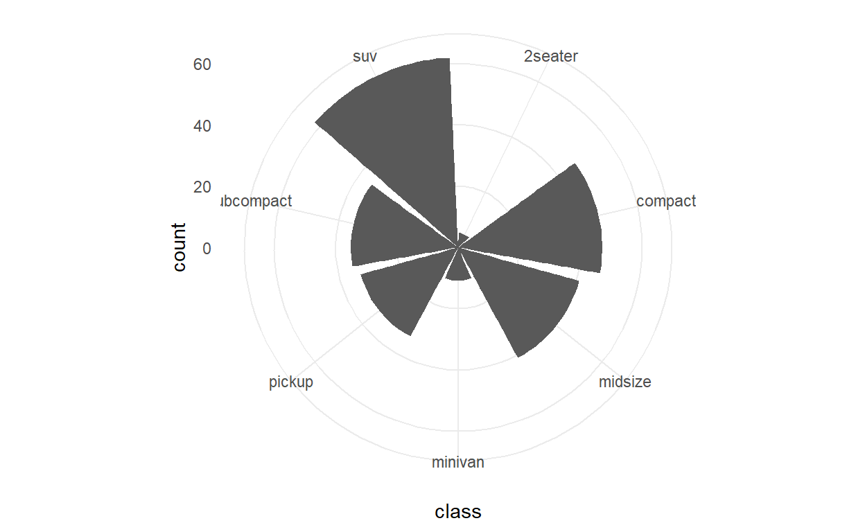
ggplot(mpg) +
  geom_bar(aes(x = class)) +
  coord_polar(theta = 'y') +
  expand_limits(y = 70)
You can zoom both on the scale…
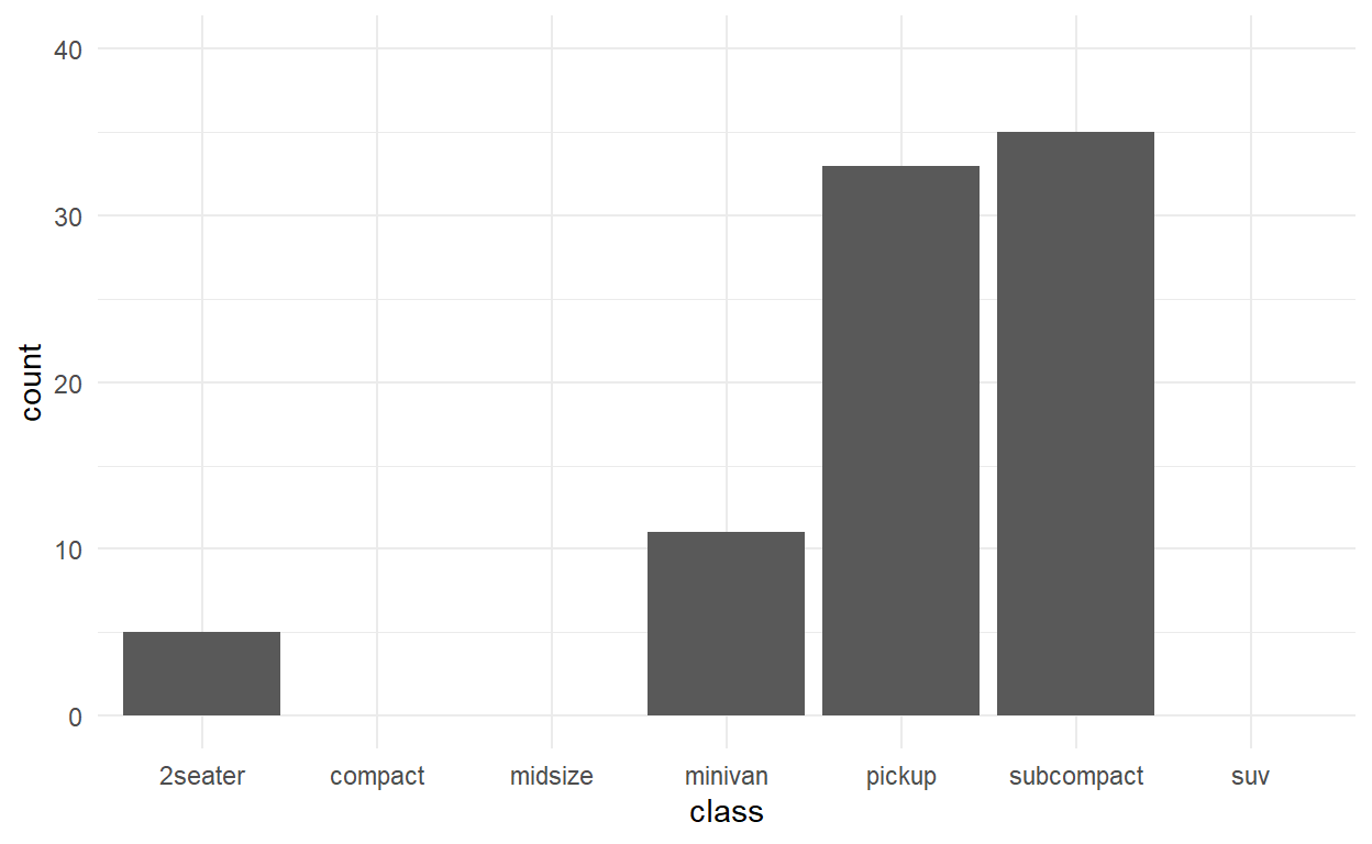
ggplot(mpg) +
  geom_bar(aes(x = class)) +
  scale_y_continuous(limits = c(0, 40))
and in the coord. You usually want the latter as it avoids changing the plotted data
ggplot(mpg) +
  geom_bar(aes(x = class)) +
  coord_cartesian(ylim = c(0, 40))
Coordinates exercises
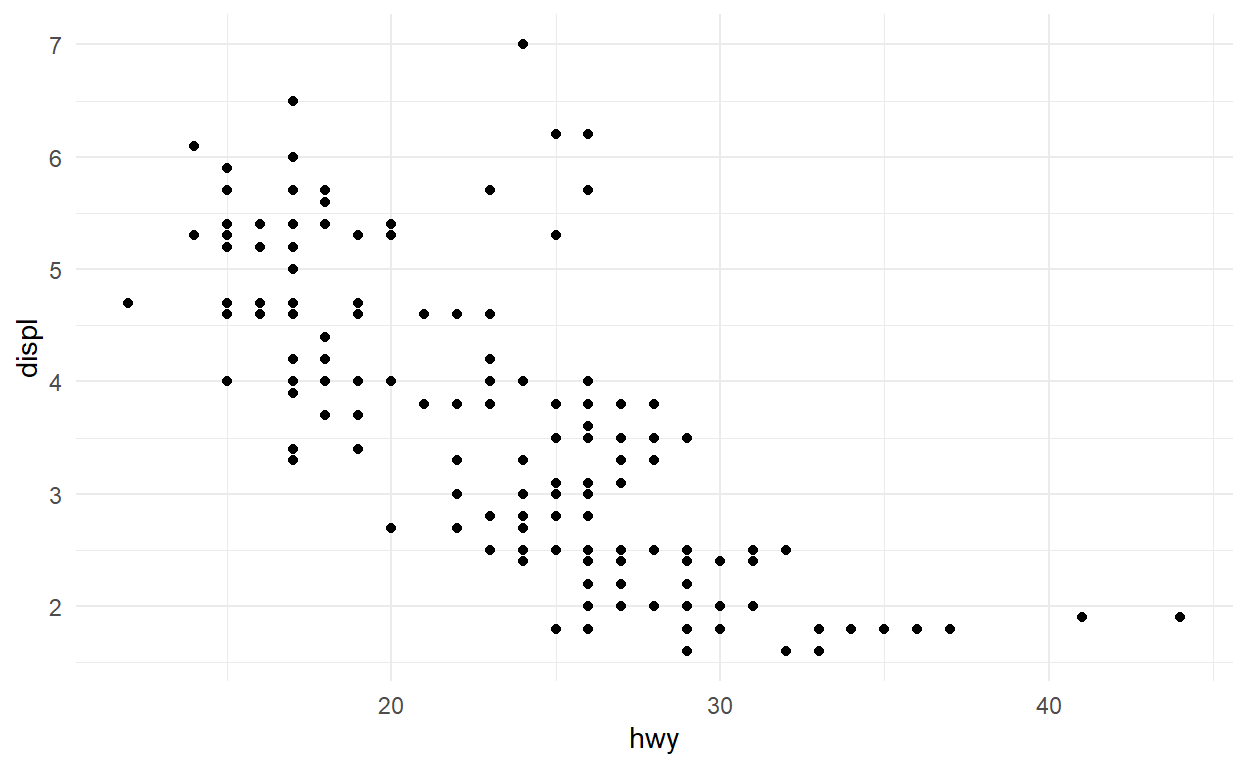
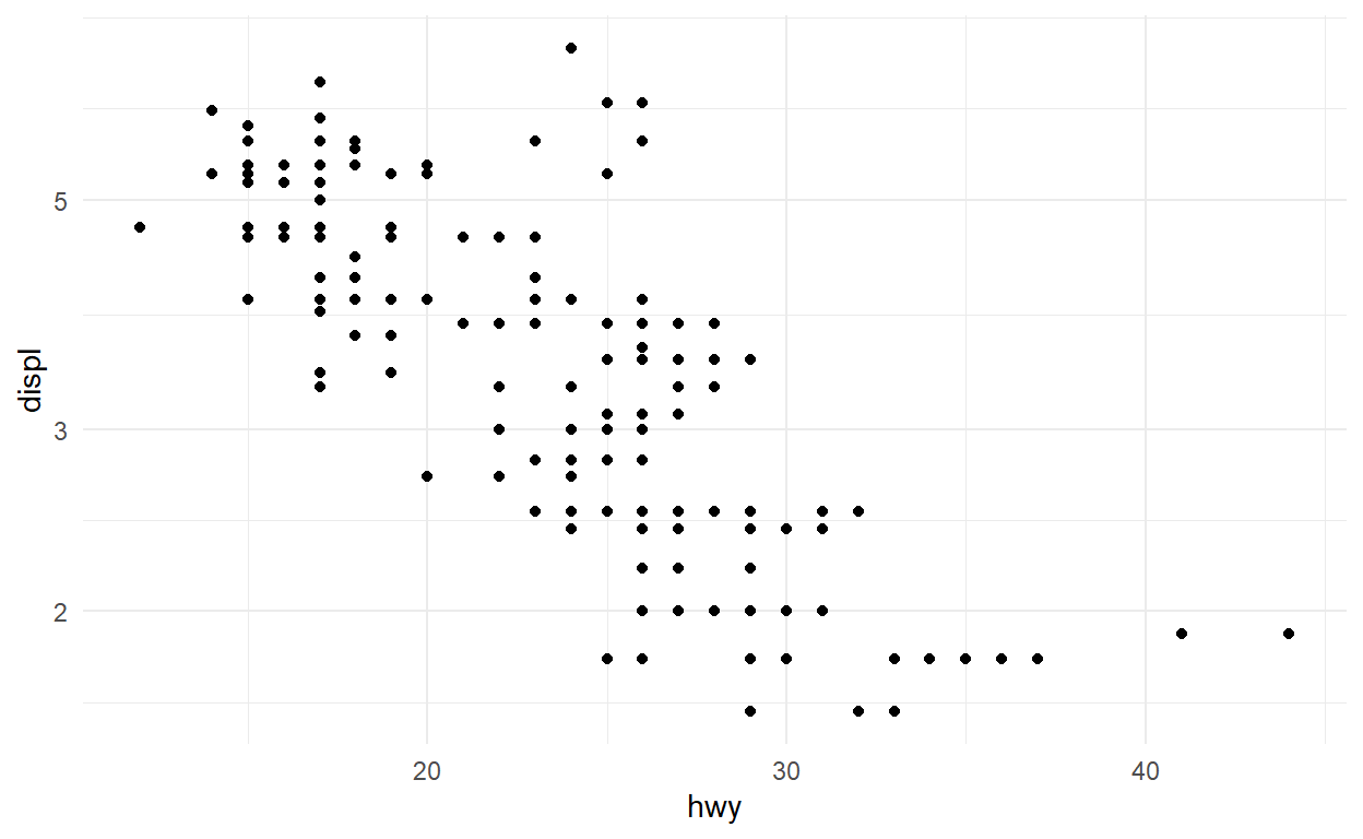
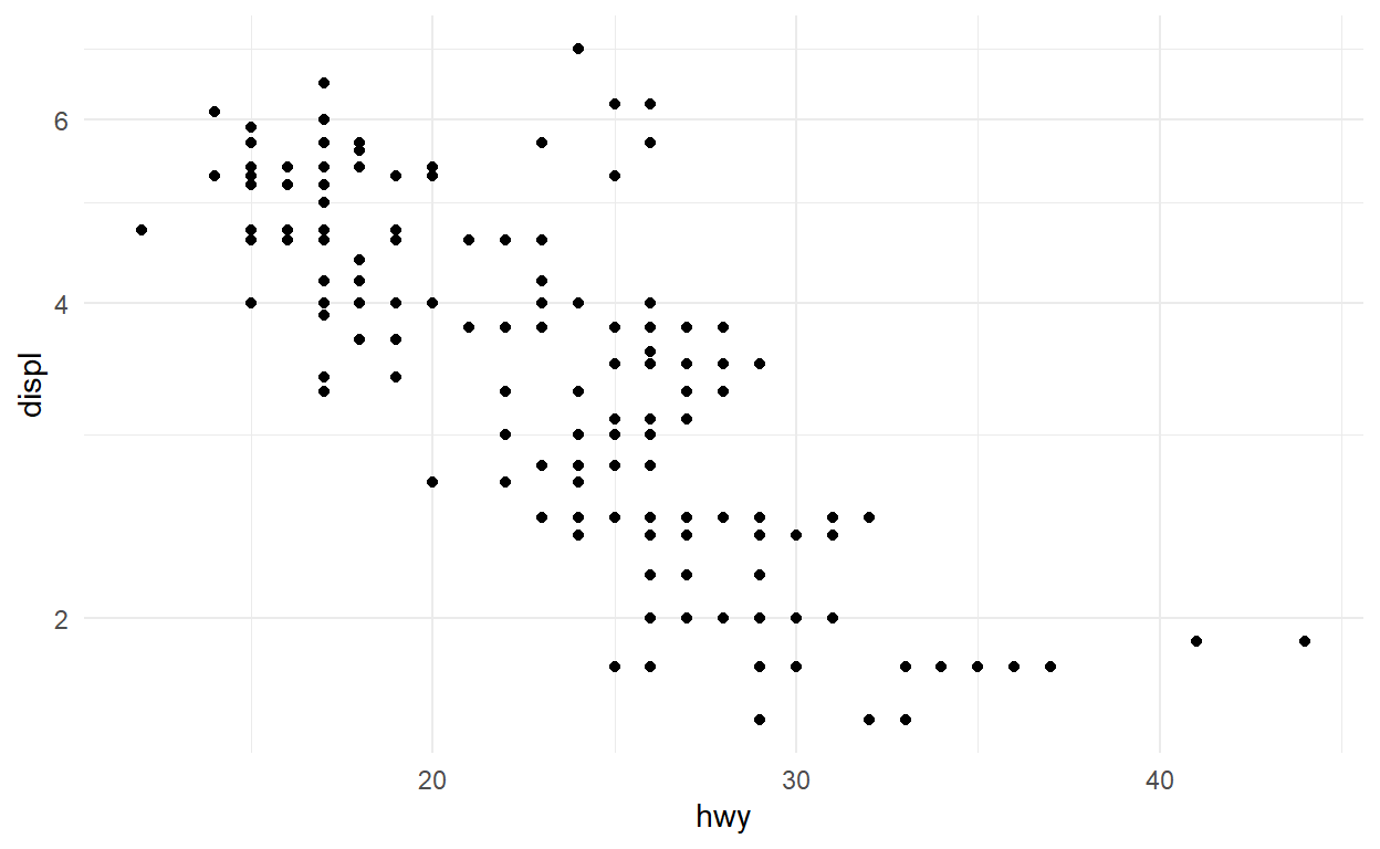
In the same way as limits can be set in both the positional scale and the coord, so can transformations, using coord_trans(). Modify the code below to apply a log transformation to the y axis; first using scale_y_continuous(), and then using coord_trans(). Compare the results — how do they differ?
ggplot(mpg) +
  geom_point(aes(x = hwy, y = displ))
ggplot(mpg) +
  geom_point(aes(x = hwy, y = displ)) +
  scale_y_log10()
ggplot(mpg) +
  geom_point(aes(x = hwy, y = displ)) +
  coord_trans(y = "log10")
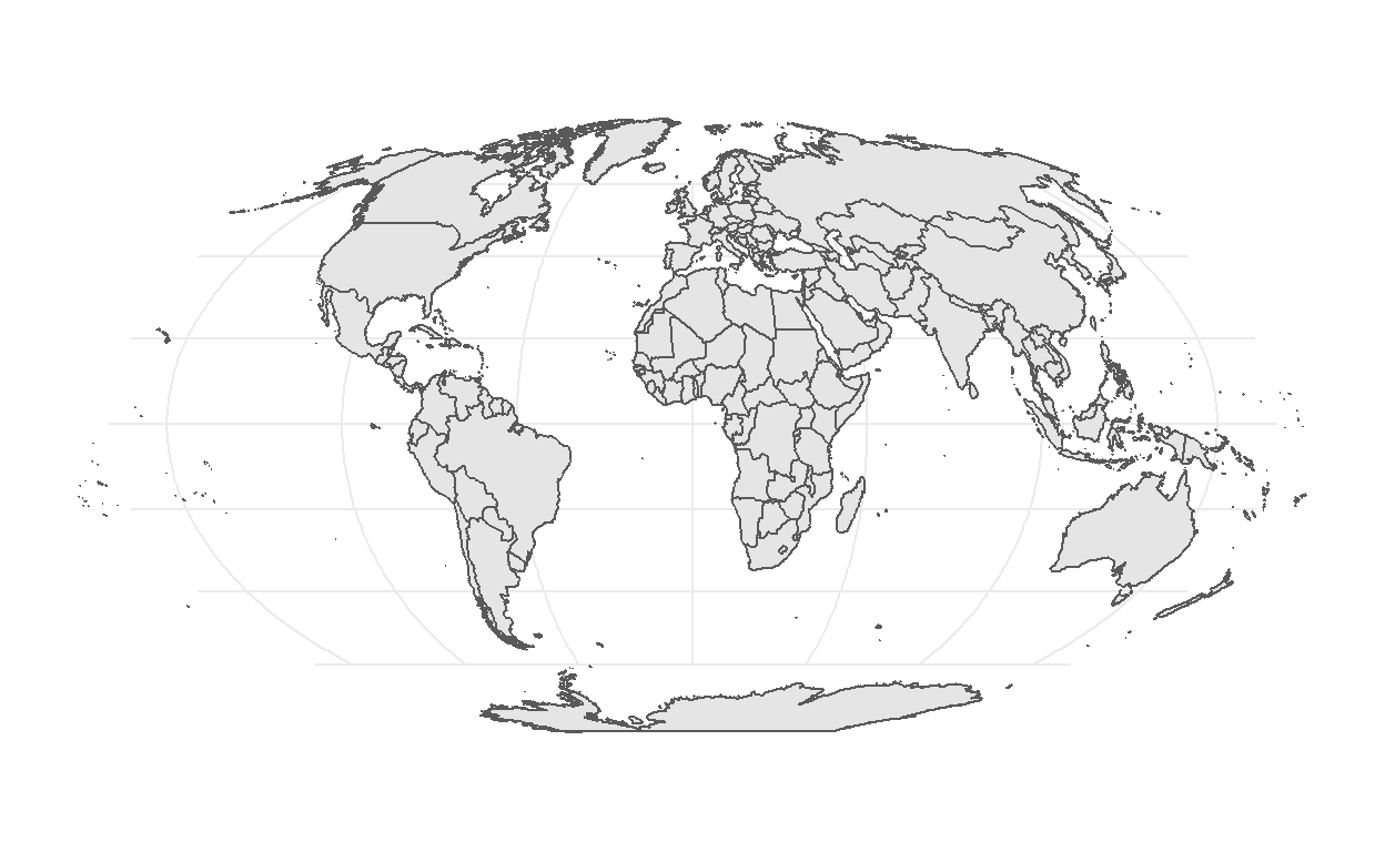
Coordinate systems are particularly important in cartography. While we will not spend a lot of time with it in this workshop, spatial plotting is well supported in ggplot2 with geom_sf() and coord_sf() (which interfaces with the sf package). The code below produces a world map. Try changing the crs argument in coord_sf() to be '+proj=robin' (This means using the Robinson projection).
# Get the borders of all countries
world <- sf::st_as_sf(maps::map('world', plot = FALSE, fill = TRUE))
world <- sf::st_wrap_dateline(world,
                              options = c("WRAPDATELINE=YES", "DATELINEOFFSET=180"),
                              quiet = TRUE)
# Plot code
ggplot(world) +
  geom_sf() +
  coord_sf(crs = "+proj=moll")
Maps are a huge area in data visualisation and simply too big to cover in this workshop. If you want to explore further I advice you to explore the r-spatial wbsite as well as the website for the sf package
Theme
Theming defines the feel and look of your final visualisation and is something you will normally defer to the final polishing of the plot. It is very easy to change looks with a prebuild theme
ggplot(mpg) +
  geom_bar(aes(y = class)) +
  facet_wrap(vars(year)) +
  theme_minimal()
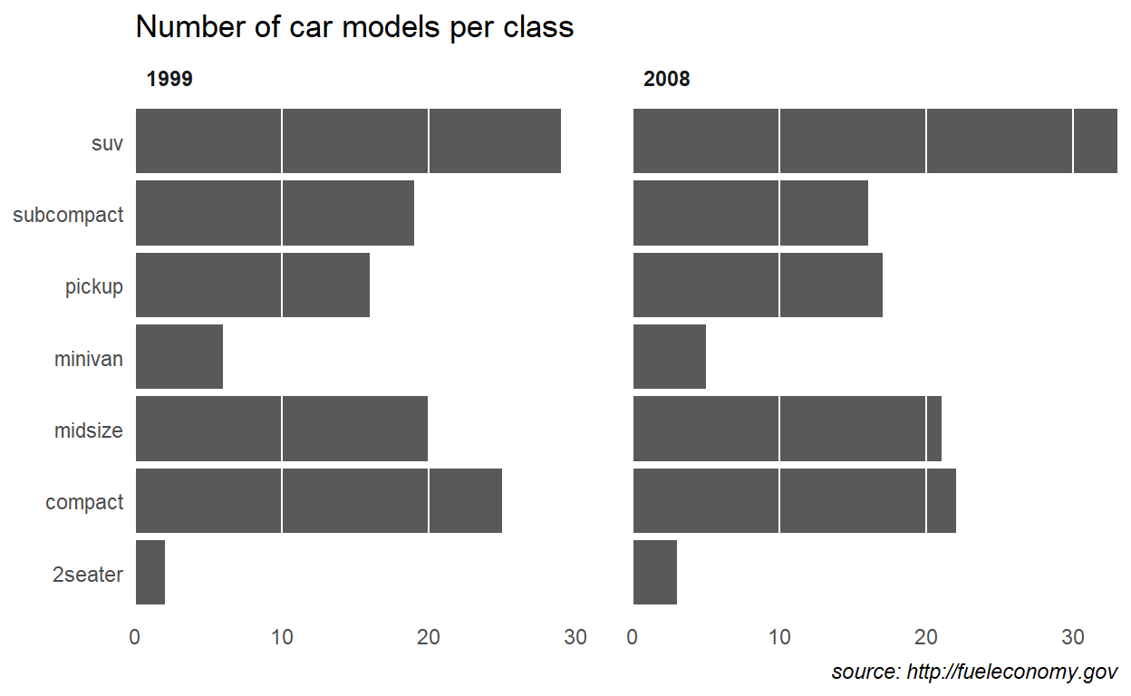
Further adjustments can be done in the end to get exactly the look you want
ggplot(mpg) +
  geom_bar(aes(y = class)) +
  facet_wrap(vars(year)) +
  labs(title = "Number of car models per class",
       caption = "source: http://fueleconomy.gov",
       x = NULL,
       y = NULL) +
  scale_x_continuous(expand = c(0, NA)) +
  theme_minimal() +
  theme(
    text = element_text('Avenir Next Condensed'),
    strip.text = element_text(face = 'bold', hjust = 0),
    plot.caption = element_text(face = 'italic'),
    panel.grid.major = element_line('white', size = 0.5),
    panel.grid.minor = element_blank(),
    panel.grid.major.y = element_blank(),
    panel.ontop = TRUE
  )
Theme exercises
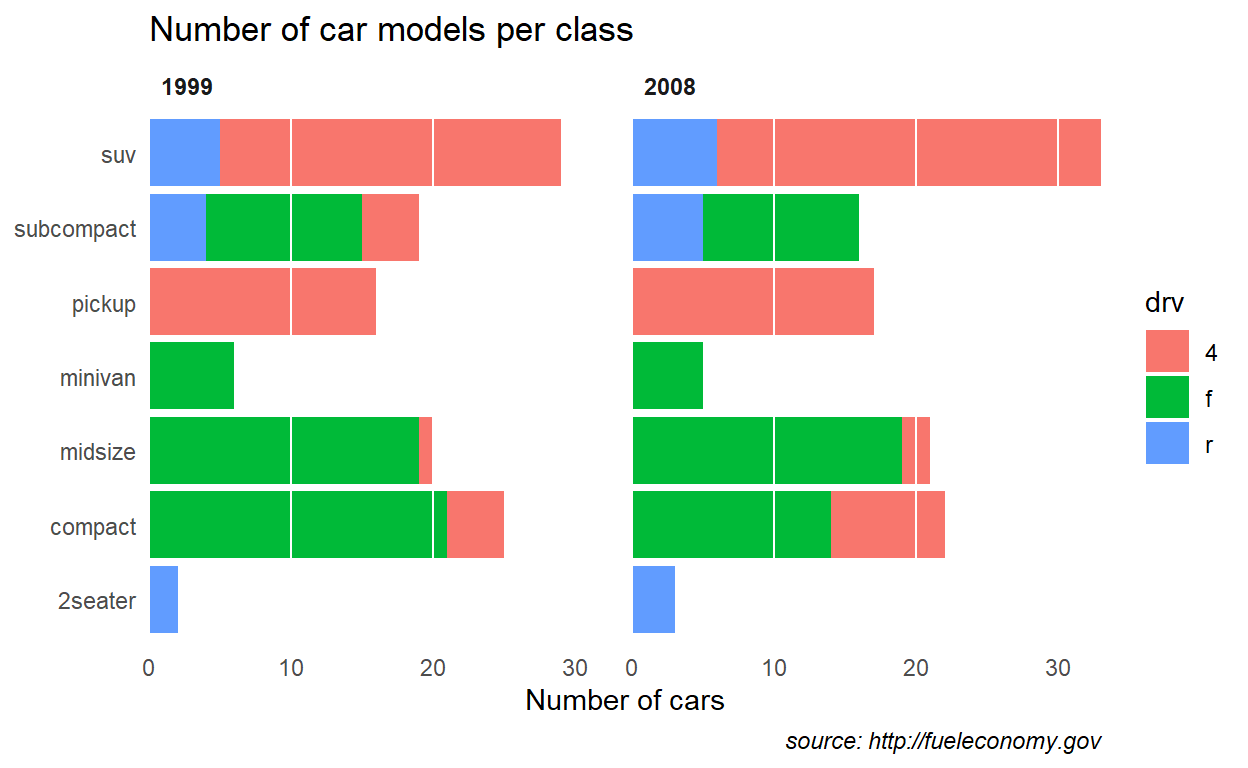
Themes can be overwhelming, especially as you often try to optimise for beauty while you learn. To remove the last part of the equation, the exercise is to take the plot given below and make it as hideous as possible using the theme function. Go absolutely crazy, but take note of the effect as you change different settings.
ggplot(mpg) +
  geom_bar(aes(y = class, fill = drv)) +
  facet_wrap(vars(year)) +
  labs(title = "Number of car models per class",
       caption = "source: http://fueleconomy.gov",
       x = 'Number of cars',
       y = NULL) +
  scale_x_continuous(expand = c(0, NA)) +
  theme_minimal() +
  theme(
    text = element_text('Avenir Next Condensed'),
    strip.text = element_text(face = 'bold',
                              hjust = 0),
    plot.caption = element_text(face = 'italic'),
    panel.grid.major = element_line('white',
                                    size = 0.5),
    panel.grid.minor = element_blank(),
    panel.grid.major.y = element_blank(),
    panel.ontop = TRUE
  )
Extensions
While ggplot2 comes with a lot of batteries included, the extension ecosystem provides priceless additional features
Plot composition
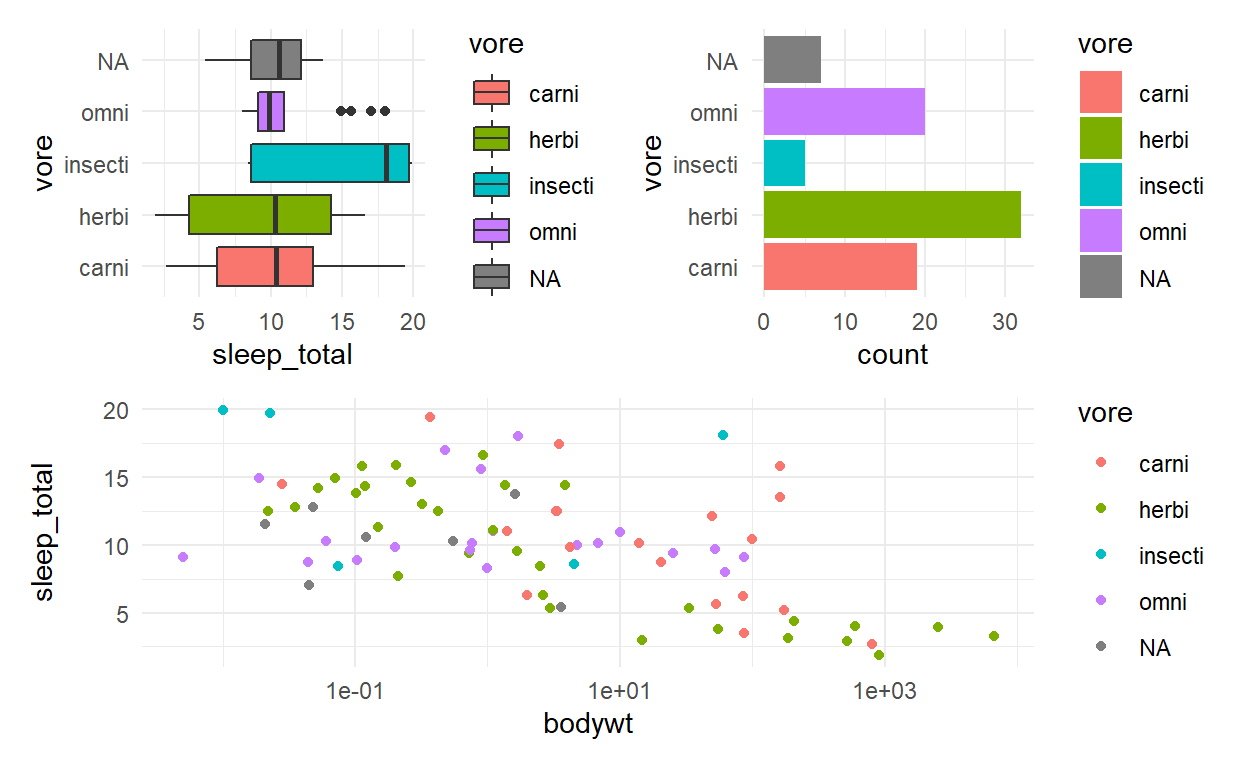
We start by creating 3 separate plots
# ?msleep
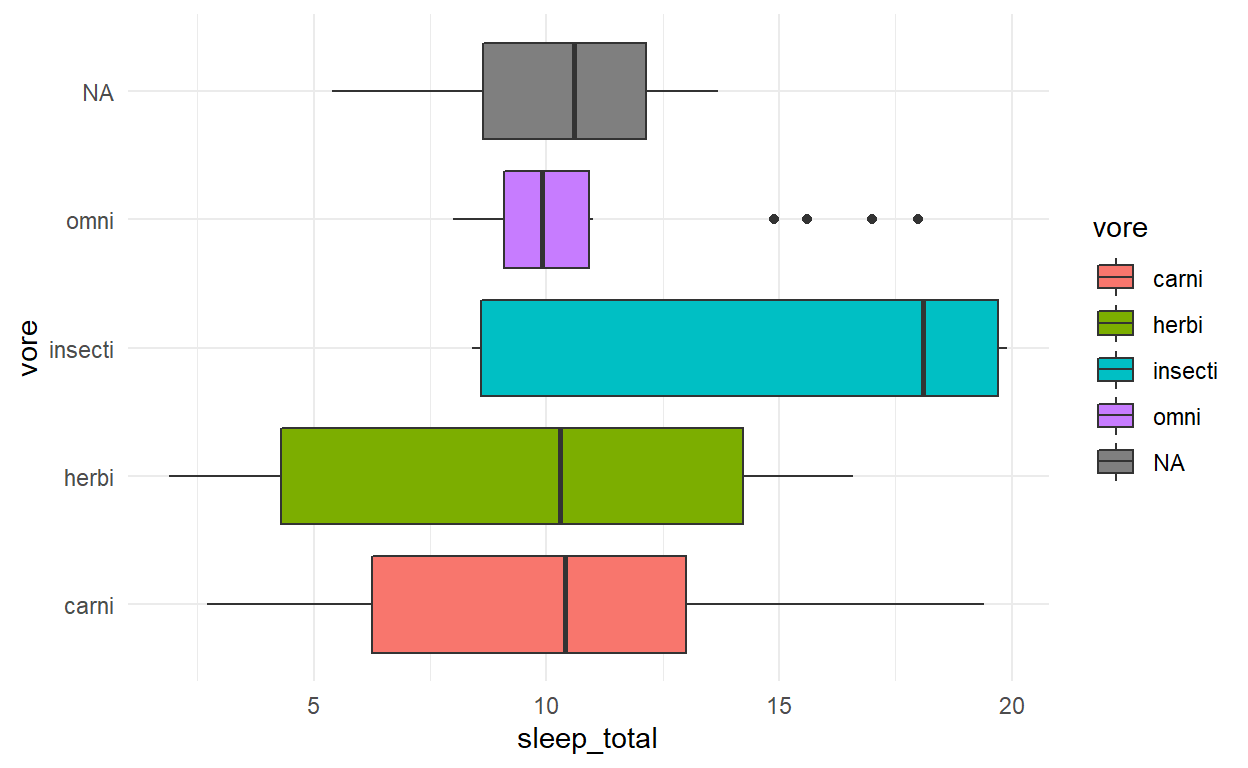
p1 <- ggplot(msleep) +
geom_boxplot(aes(x = sleep_total, y = vore, fill = vore))
p1
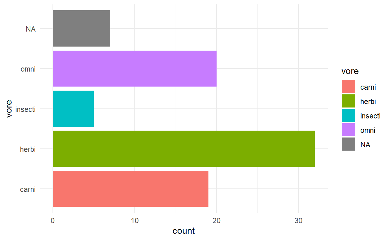
p2 <- ggplot(msleep) +
  geom_bar(aes(y = vore, fill = vore))
p2
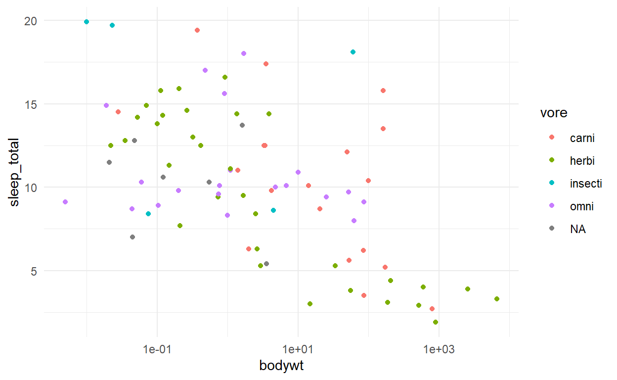
p3 <- ggplot(msleep) +
  geom_point(aes(x = bodywt, y = sleep_total, colour = vore)) +
  scale_x_log10()
p3
Combining them with patchwork is a breeze using the different operators
p1 + p2 + p3
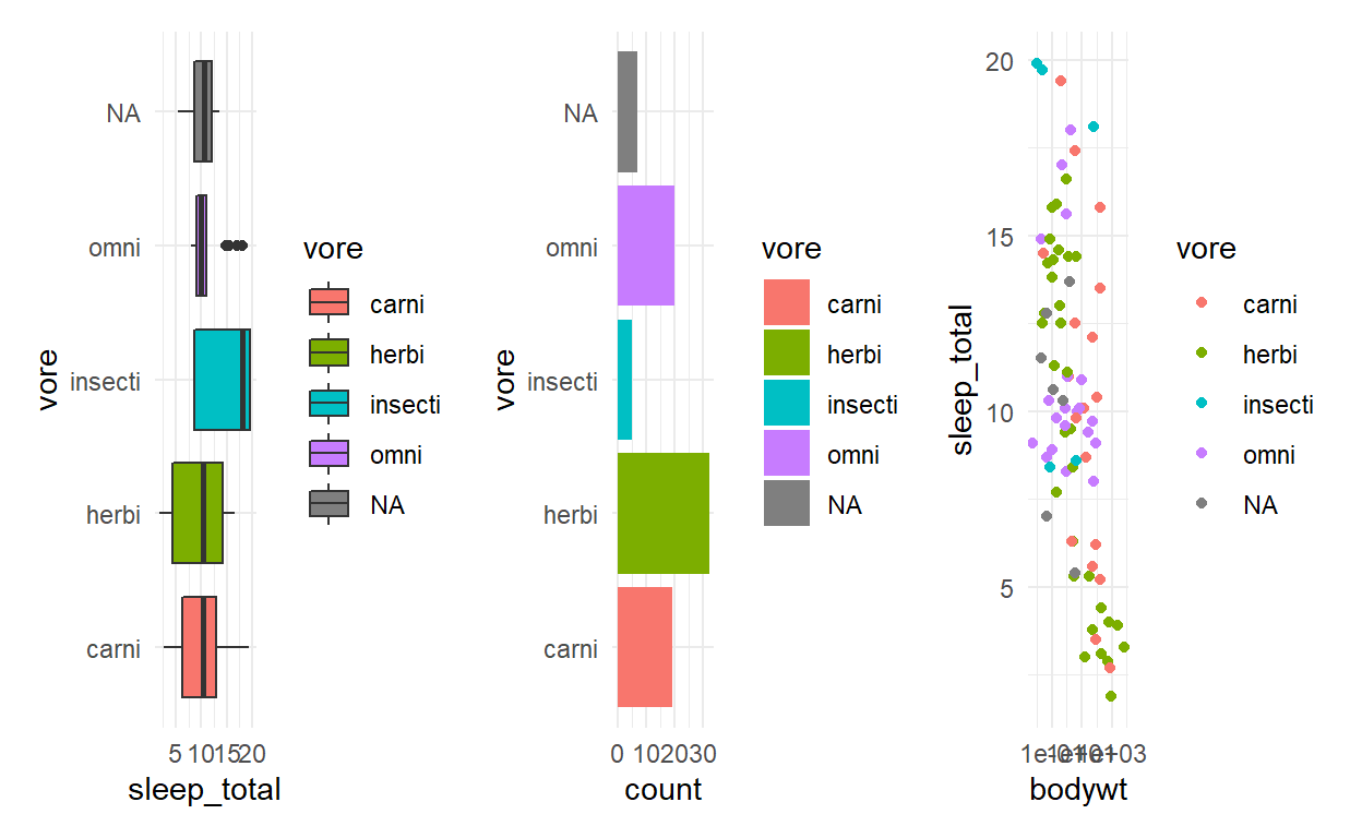
(p1 | p2) /
   p3
p_all <- (p1 | p2) /
            p3
p_all + plot_layout(guides = 'collect')
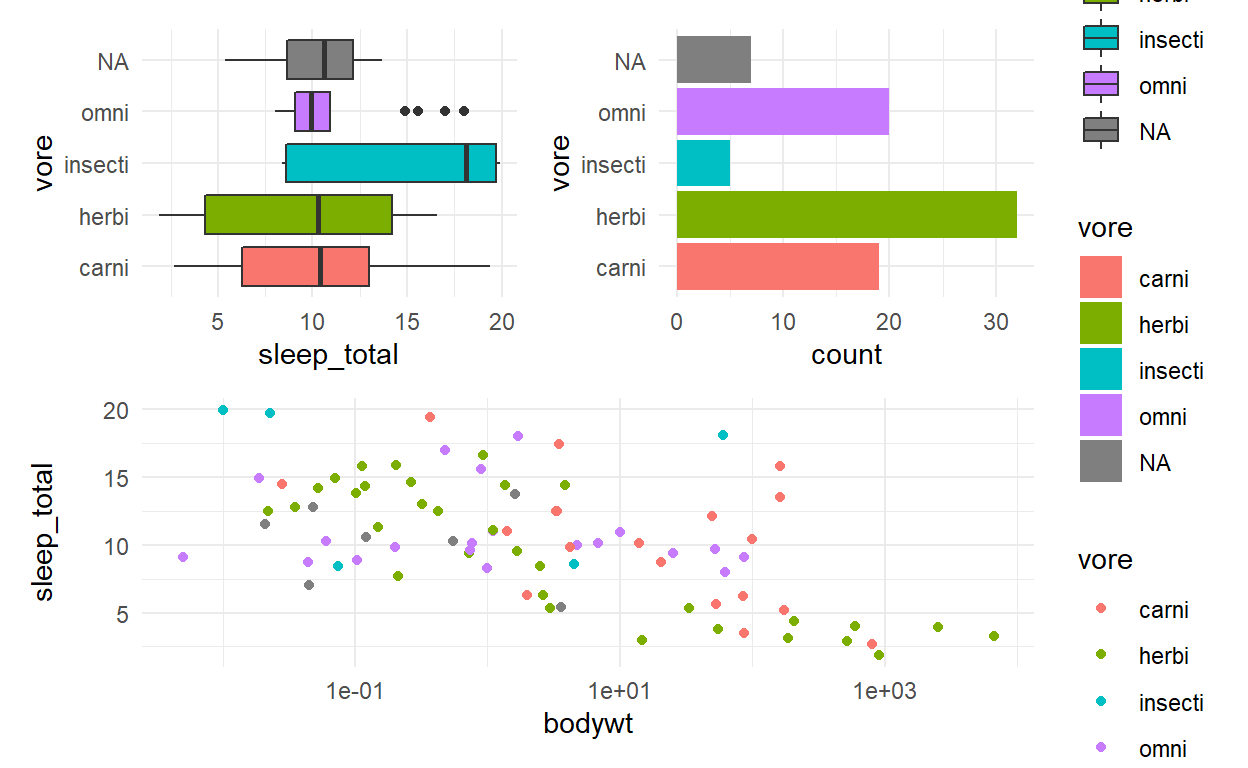
p_all & theme(legend.position = 'none')
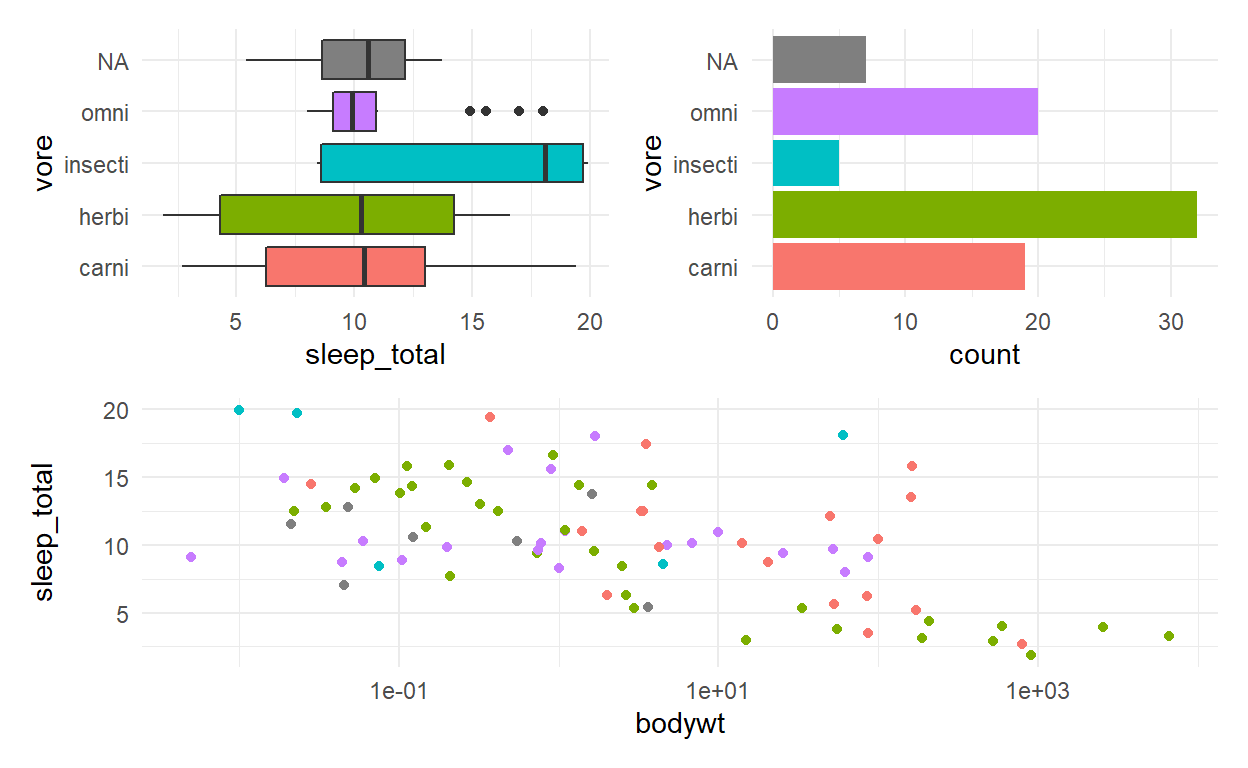
p_all <- p_all & theme(legend.position = 'none')
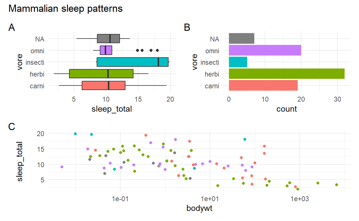
p_all + plot_annotation(
title = 'Mammalian sleep patterns',
tag_levels = 'A'
)
Excercises
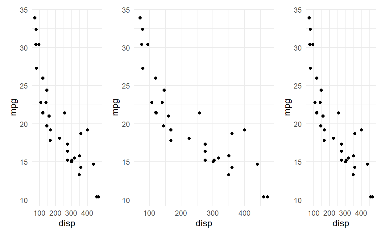
Patchwork will assign the same amount of space to each plot by default, but this can be controlled with the widths and heights argument in plot_layout(). This can take a numeric vector giving their relative sizes (e.g. c(2, 1) will make the first plot twice as big as the second). Modify the code below so that the middle plot takes up half of the total space:
p <- ggplot(mtcars) +
  geom_point(aes(x = disp, y = mpg))
p + p + p + plot_layout(widths = c(1,2,1))
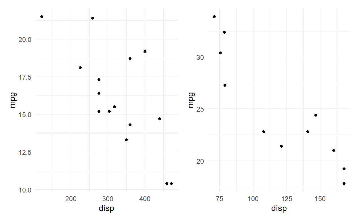
The & operator can be used with any type of ggplot2 object, not just themes. Modify the code below so the two plots share the same y-axis (same limits)
p1 <- ggplot(mtcars[mtcars$gear == 3,]) +
  geom_point(aes(x = disp, y = mpg))
p2 <- ggplot(mtcars[mtcars$gear == 4,]) +
  geom_point(aes(x = disp, y = mpg))
p1 + p2
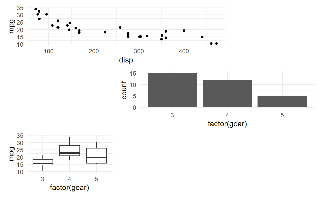
Patchwork contains many features for fine tuning the layout and annotation. Very complex layouts can be obtained by providing a design specification to the design argument in plot_layout(). The design can be defined as a textual representation of the cells. Use the layout given below. How should the textual representation be understood.
p1 <- ggplot(mtcars) +
  geom_point(aes(x = disp, y = mpg))
p2 <- ggplot(mtcars) +
  geom_bar(aes(x = factor(gear)))
p3 <- ggplot(mtcars) +
  geom_boxplot(aes(x = factor(gear), y = mpg))
layout <- '
AA#
#BB
C##
'
p1 + p2 + p3 + plot_layout(design = layout)
QUIZ 8
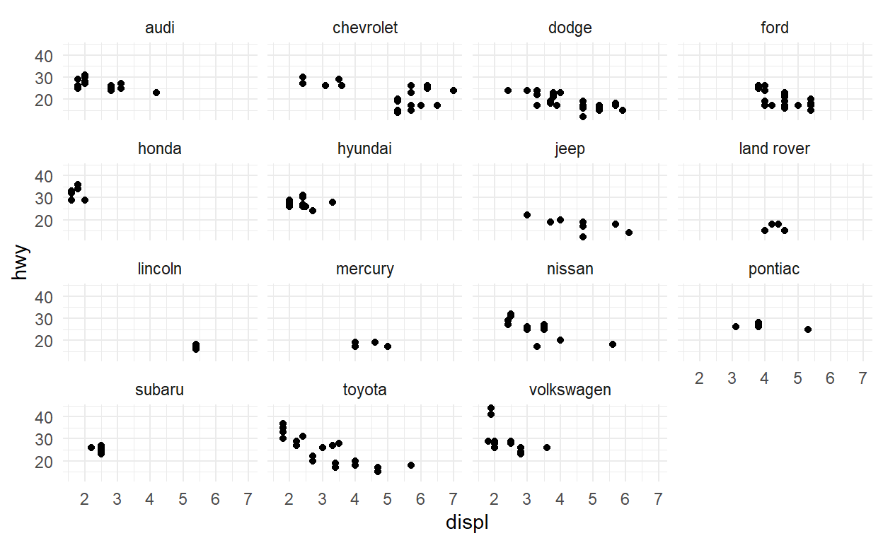
Q1
ggplot(data = mpg) +
  geom_point(aes(x = displ, y = hwy)) +
  facet_wrap(facets = vars(manufacturer))
Q2
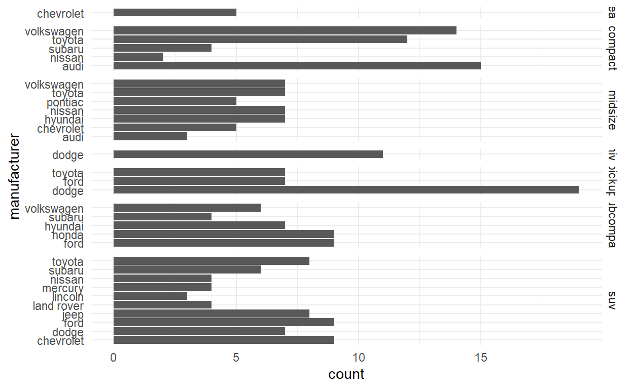
ggplot(mpg) +
  geom_bar(aes(y = manufacturer)) +
  facet_grid(vars(class), scales = "free_y", space = "free_y")
Q3
spend_time <- read_csv("spend_time.csv")
head(spend_time)
# A tibble: 6 x 3
activity year avg_hours
<chr> <dbl> <dbl>
1 leisure/sports 2019 5.19
2 leisure/sports 2018 5.27
3 leisure/sports 2017 5.24
4 leisure/sports 2016 5.13
5 leisure/sports 2015 5.21
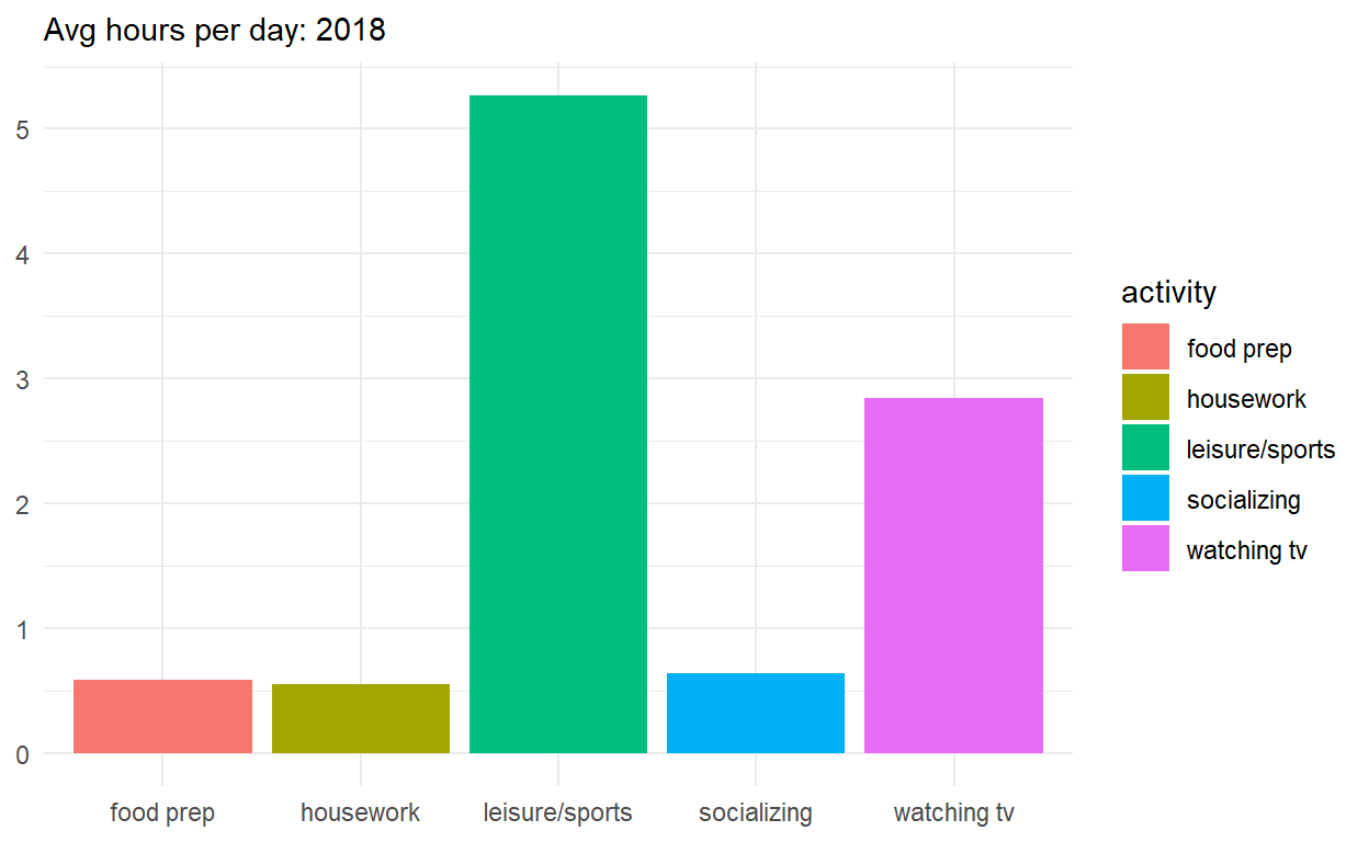
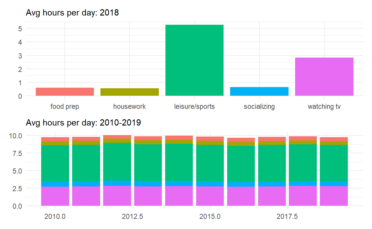
6 leisure/sports 2014 5.3 p1 <- spend_time %>% filter(year == "2018") %>%
ggplot() +
geom_col(aes(x = activity , y = avg_hours, fill = activity)) +
scale_y_continuous(breaks = seq(0,6, by = 1 )) +
labs(subtitle = "Avg hours per day: 2018", x = NULL, y = NULL)
p1
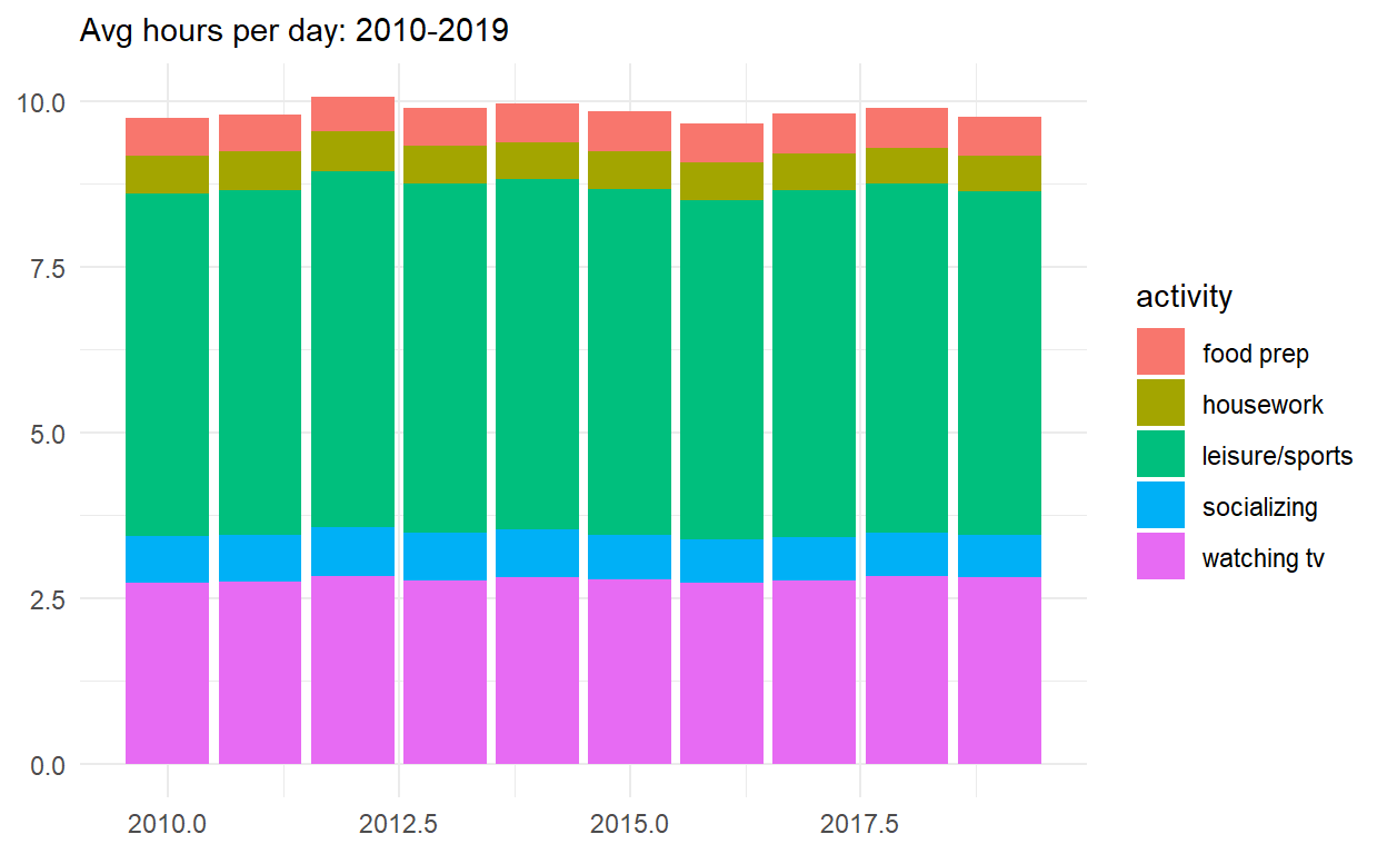
p2 <- spend_time %>%
  ggplot() +
  geom_col(aes(x = year, y = avg_hours, fill = activity)) +
  labs(subtitle = "Avg hours per day: 2010-2019", x= NULL, y = NULL)

p2
p_all <- p1/p2
p_all
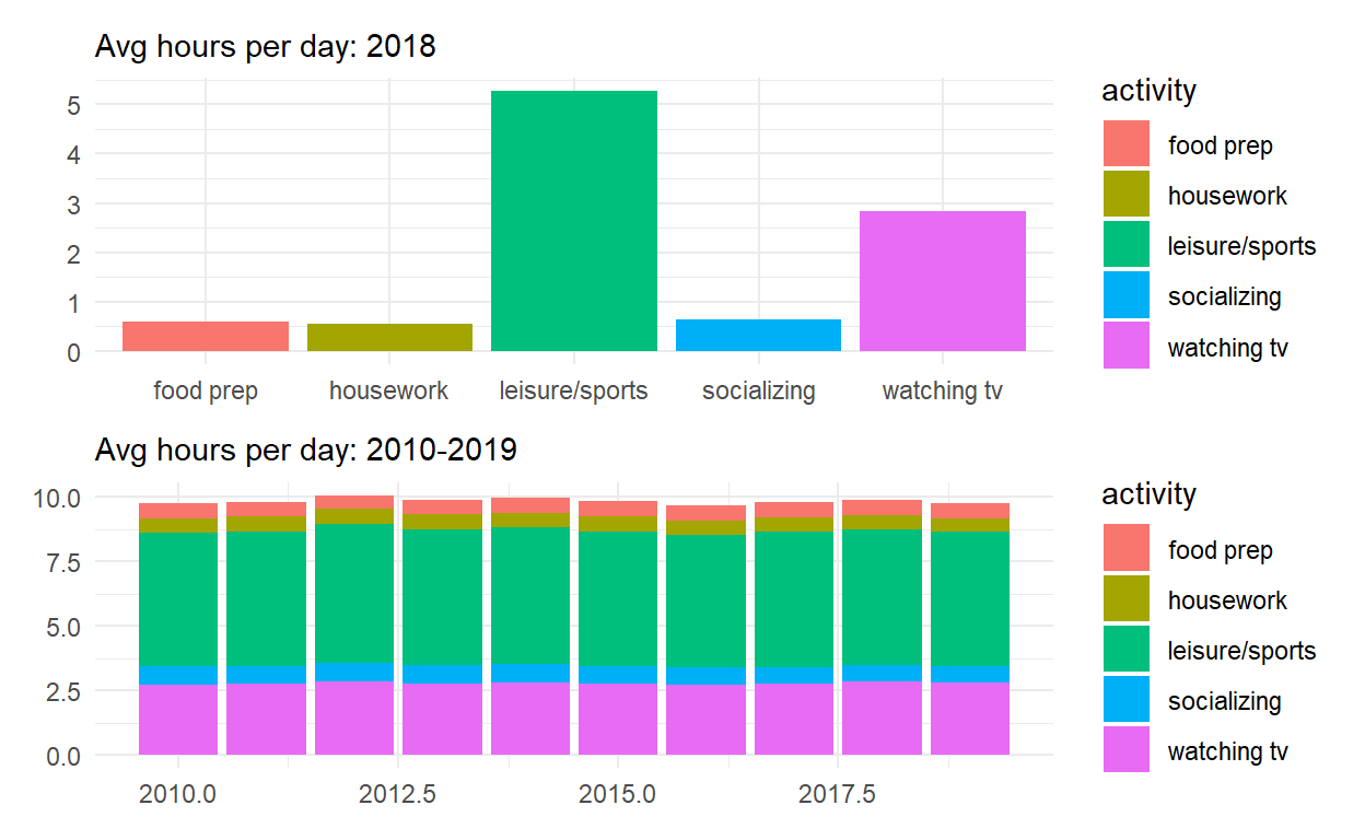
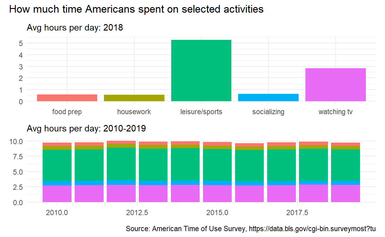
p_all_no_legend <- p_all & theme(legend.position = 'none')
p_all_no_legend
p_all_no_legend +
  plot_annotation(title = "How much time Americans spent on selected activities",
                  caption = "Source: American Time of Use Survey, https://data.bls.gov/cgi-bin.surveymost?tu")
Q4
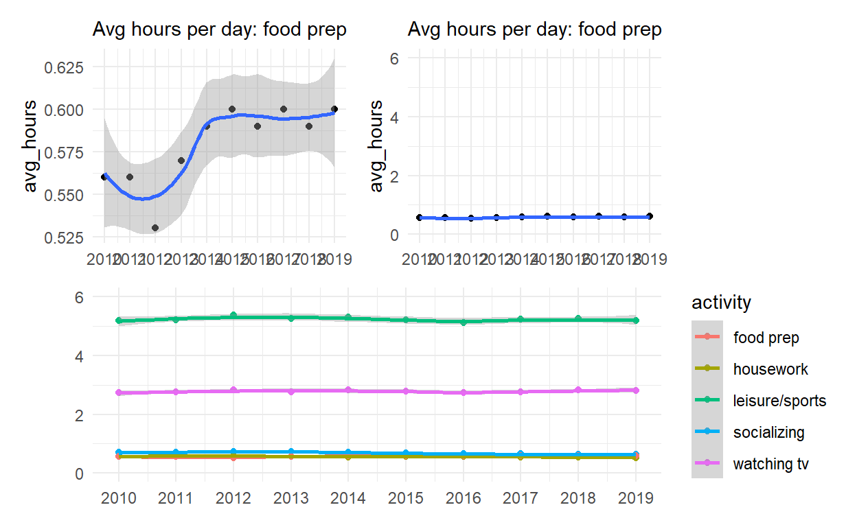
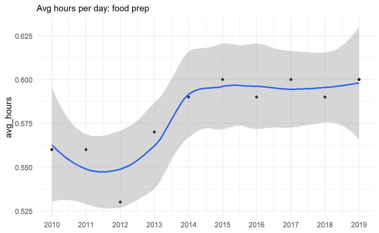
p4 <- spend_time %>% filter(activity == "food prep") %>%
  ggplot() +
  geom_point(aes(x = year, y = avg_hours)) +
  geom_smooth(aes(x = year, y = avg_hours)) +
  scale_x_continuous(breaks = seq(2010, 2019, by = 1)) +
  labs(subtitle = "Avg hours per day: food prep", x = NULL, Y = NULL)

p4
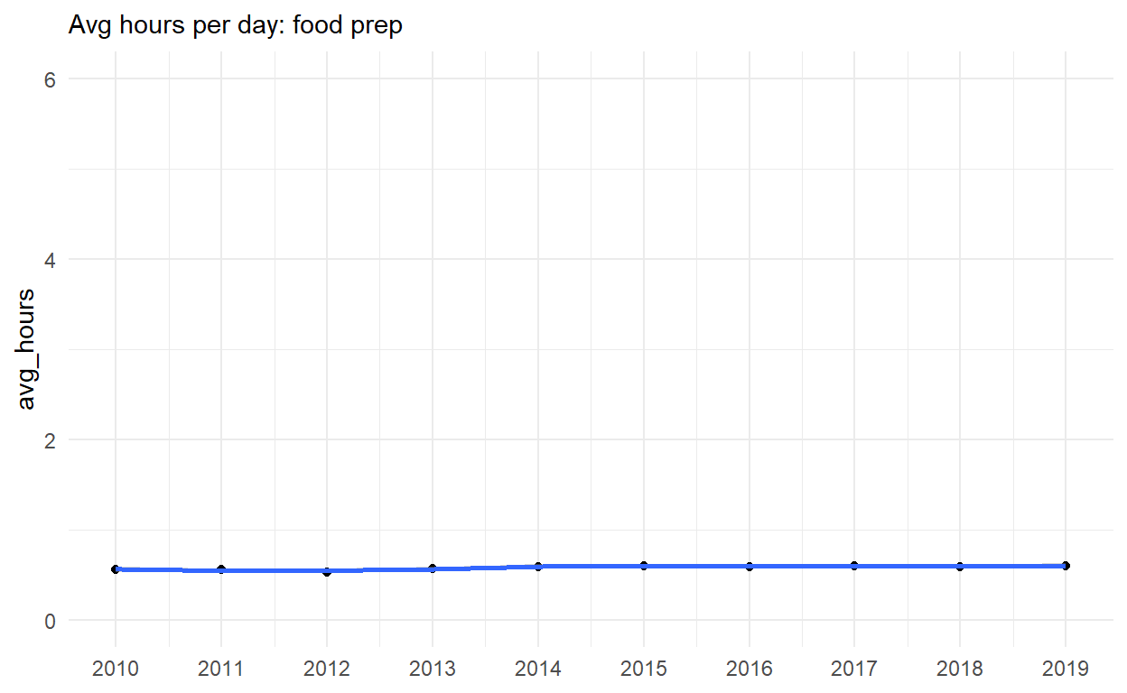
p5 <- p4 + coord_cartesian(ylim = c(0,6))
p5
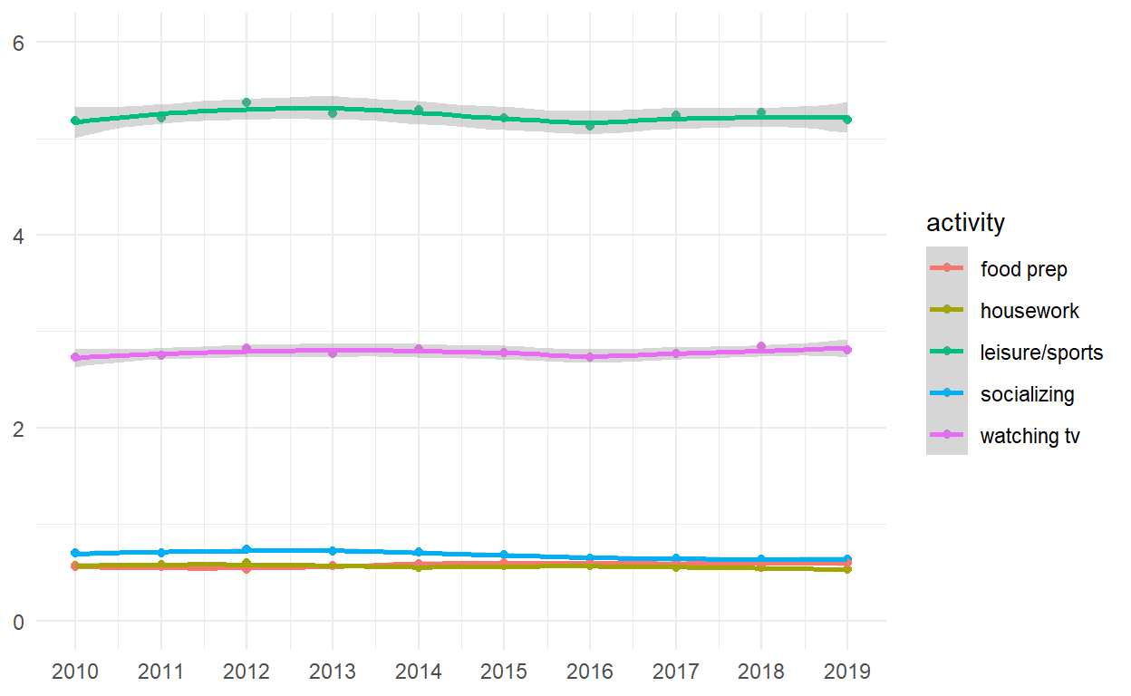
p6 <- spend_time %>%
  ggplot() +
  geom_point(aes(x = year, y = avg_hours, color = activity, group = activity)) +
  geom_smooth(aes(x = year, y = avg_hours, color = activity, group = activity)) +
  scale_x_continuous(breaks = seq(2010, 2019, by =1 )) +
  coord_cartesian(ylim = c(0,6)) +
  labs(x = NULL, y = NULL)

p6
(p4|p5)/p6